The Map component is a powerful tool for Drive-to-Store campaigns and location-based storytelling. It allows you to showcase multiple points of interest, providing users with geographic context and interactive details for each location.
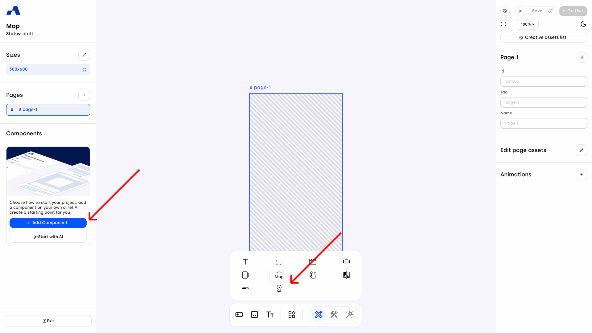
Adding a Map
You can add a Map component to your creative either via the toolbar or from the left sidebar. Once inserted, the component will appear in the Layers panel, where you can manage its position and hierarchy within the page.
Right Sidebar Configuration
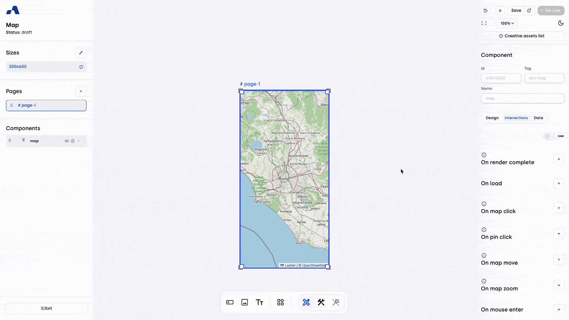
When the Map is selected, the right sidebar updates with a dedicated toggle at the top, allowing you to switch between three main functional areas: Design, Interactions, and Data.
Design Section
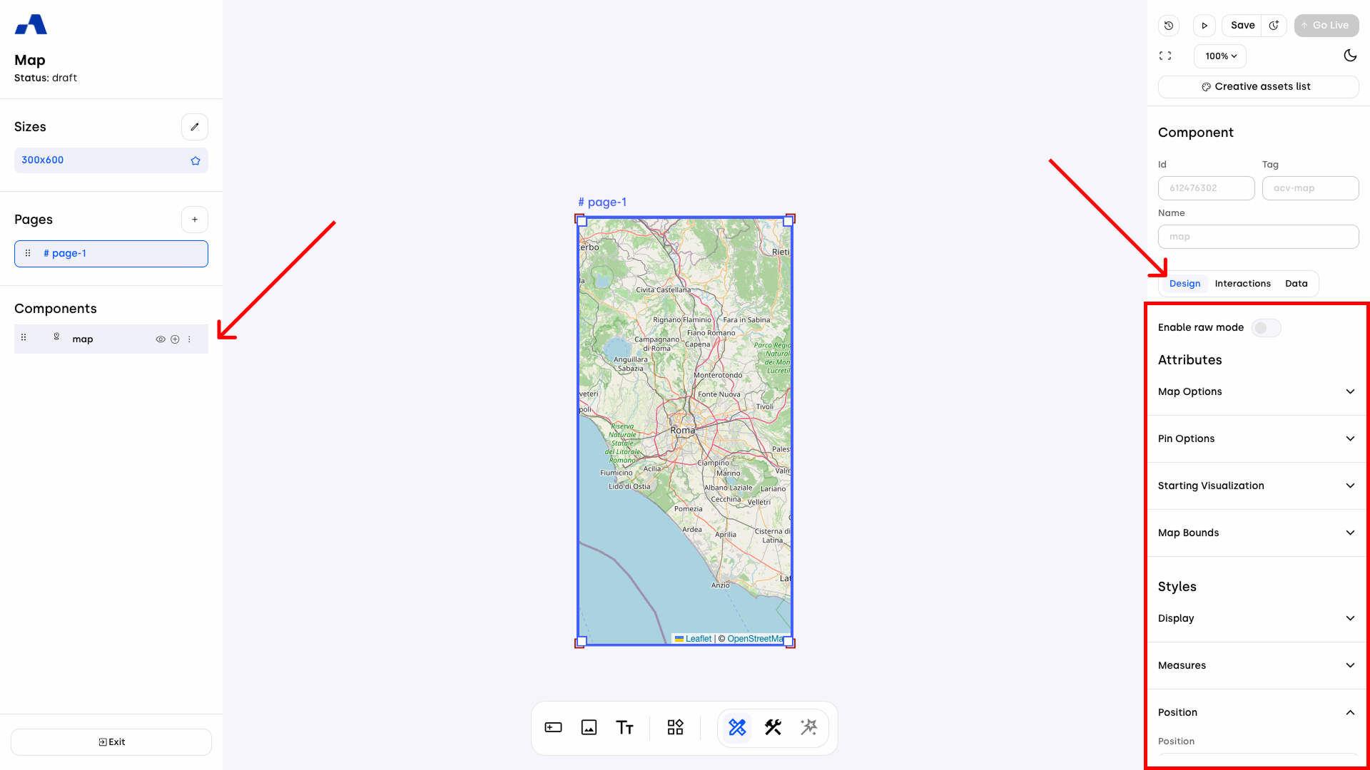
The Design section is divided into two macro-groups: Attributes, focusing on the map's functional behavior and assets, and Styles, dedicated to the visual layout and CSS properties.
1. Attributes
This group contains the core settings for map logic and marker appearance:
Map Options:
Geolocation: When enabled, the ad requests access to the device's GPS sensors. If granted, the map automatically centers and displays the marker closest to the user's current position, ensuring immediate relevance.
Min Zoom & Max Zoom: Define the zoom range limits to control how much the user can zoom in or out.
Pin Options:
Image Source: Upload a custom asset (logo, branded icon, or custom shape) to replace the standard map pins.
Pin Width & Pin Height: Set the exact dimensions for your custom markers.
Custom Cluster Design: By ticking this checkbox, a dedicated Cluster section is activated within the Styles group. This allows you to customize the appearance of grouped markers when they overlap in a specific area.
Starting Visualization: This section determines what the user sees when the map first loads.
Fit Locations: When enabled, the map automatically adjusts its zoom and center to ensure that all markers defined in the Data table are visible within the screen at once.
Manual Configuration: If Fit Locations is unchecked, you can manually specify the initial view using three fields:
Initial Zoom: Set the starting magnification level.
Latitude & Longitude: Define the exact geographic center of the map.
Note that if the Geolocation option is enabled and the user grants permission, the map will prioritize the user's current position (centering on the closest marker), overriding both the Fit Locations and manual settings.
Map Bounds: This section allows you to define a specific geographic "fence," restricting the navigable area to ensure users stay focused on the relevant region.
Limit Map Bounds (Checkbox): Ticking this checkbox reveals two dedicated accordions to define the diagonal corners of your allowed rectangular area:
North East Bound (Accordion): Defines the "top-right" corner of the boundary and includes Latitude and Longitude fields.
South West Bound (Accordion): Defines the "bottom-left" corner of the boundary and includes Latitude and Longitude fields.
2. Styles
This group manages the component's aesthetic integration within the creative.
Cluster (Conditional): This section becomes available only when the Custom Cluster Design checkbox is active in the Attributes group. It provides specific controls to style the "cluster bubbles" — the indicators that show the number of markers grouped in a single location.
Width & Height: Define the diameter of the cluster bubble to ensure it fits the design of your creative.
Typography: Customize the look of the number inside the bubble:
Font Family: Choose the typeface that matches your brand.
Font Size & Font Weight: Adjust the legibility and emphasis of the counter.
Color: Set the text color for the number.
Background Color: Define the fill color of the cluster bubble.
Border Radius: Control the shape of the cluster. Set it to 50% for a perfect circle or 0 for a square indicator.
Display: Standard CSS-based controls to manage the map's presence on the page.
Type:
Block: The map is rendered as a standard block element.
None: The map is completely removed from the layout.
Visibility: Toggle whether the map is visible or hidden to the user (while still occupying its space in the layout if not set to 'None').
Z index: Manage the stacking order. A higher value brings the map to the front, ensuring it appears above other overlapping elements.
Opacity: Set the transparency level of the component, ranging from fully opaque to completely transparent.
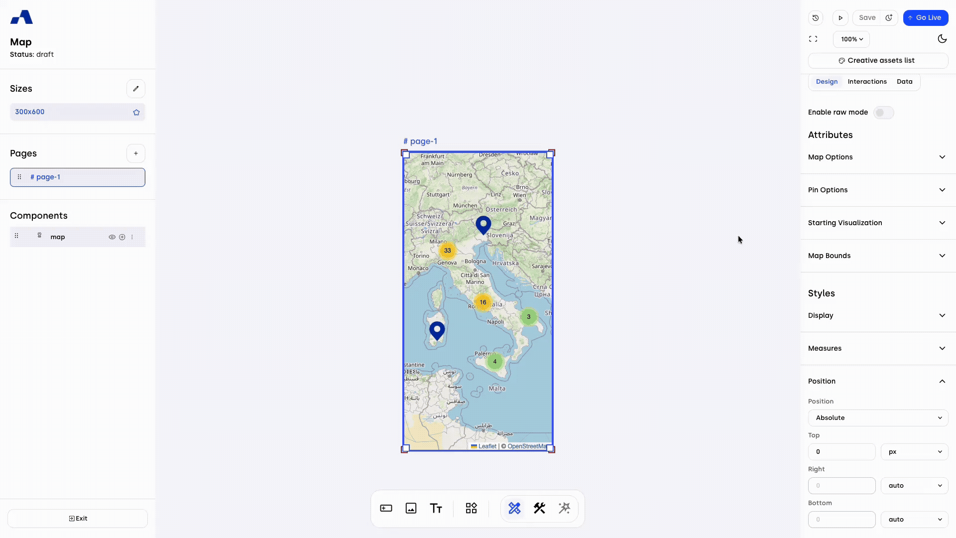
Measures: This section defines the physical dimensions of the Map component within the creative layout.
Width & Height: Set the primary size of the map (e.g., in pixels or percentage).
Position: This section controls how the Map component is situated within the creative's layout and how it behaves during user navigation.
Position Type: Choose the CSS positioning strategy:
Absolute: Positions the map relative to its nearest positioned ancestor.
Fixed: Locks the map relative to the viewport, keeping it visible even when scrolling.
Relative: Positions the map relative to its normal flow position.
Static: The default flow; Top/Right/Bottom/Left properties have no effect.
Sticky: Switches between relative and fixed depending on the user's scroll position.
Position Edges: When using any mode other than Static, you can define the exact offset from the edges of the container:
Top / Right / Bottom / Left: Set the distance from each respective edge (e.g., in pixels or percentage).
Border: This section allows you to define the visual frame of the Map component.
Width: Set the thickness of the border (e.g., in pixels).
Color: Choose the color of the border to match your brand's palette.
Radius: Adjust the roundness of the map's corners. A higher value creates rounded corners, while a value of 0 keeps them sharp.
Style: Define the appearance of the border line:
None: No border is displayed.
Solid: A continuous, single line.
Dotted: A line made of small dots.
Dashed: A line made of short dashes.
Shadow: This section adds depth to the Map component by creating a customizable shadow effect around its container.
Offset X: Moves the shadow horizontally. A positive value shifts it to the right, while a negative value shifts it to the left.
Offset Y: Moves the shadow vertically. A positive value pushes it downwards, while a negative value pulls it upwards.
Shadow Blur: Defines the softness of the shadow. A higher value creates a more blurred, diffused effect.
Shadow Spread: Controls the size of the shadow. Positive values expand the shadow, making it larger than the component itself.
Color: Sets the color and transparency of the box shadow.
CSS Shorthands: This section allows you to apply custom CSS properties directly to the component for advanced styling that goes beyond the standard UI controls. It is a powerful tool for developers to inject specific behaviors or design tweaks.
For more details, you can consult the following article: How to use Shorthands in Ads Manager Builder.Transform: This module allows you to modify the coordinate space of the Map component, changing its shape and orientation without affecting the normal document flow. Examples include Rotate (to turn the map) and Scale (to resize it).
Filter: This module applies graphical effects to the entire Map component. Common examples include Blur (to soften the image), Invert, and Grayscale.
This section is based on standard CSS structures — for more information, click here.
Interactions Section
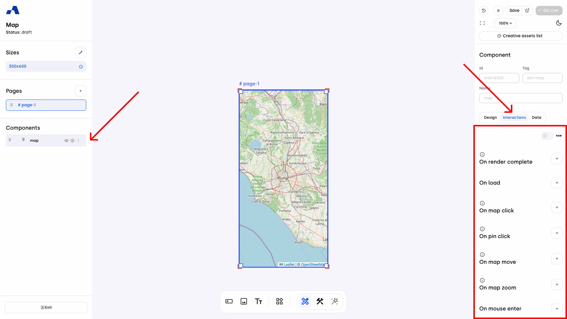
The interactions section allows you to add behaviors based on user actions. You can define what happens when users engage with the map, assigning elements and defining their behavior via the Do Action list.
Available map events:
On render complete | On load | On map click |
On pin click | On map move | On map zoom |
On mouse enter | On mouse leave | On geolocation allowed |
On geolocation denied | On change visibility |
These events can trigger animations, show/hide components, track analytics, and more.
Data Section
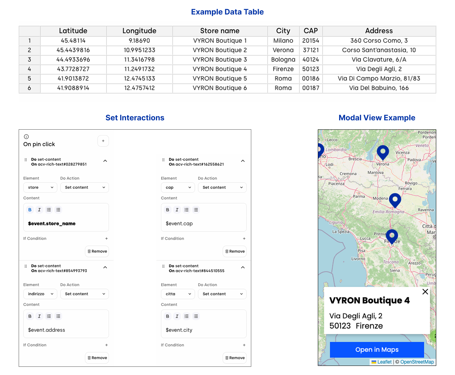
The Data section acts as the database for your map. All locations (markers) are managed through a centralized table.
1. Default Structure The table includes two mandatory columns: Latitude and Longitude.
Non-editable: These columns are foundational and cannot be deleted or renamed.
Coordinate Rules: Values must be numerical (integers or decimals), using the period (.) as a decimal separator.
Geographic Range: Latitude must be between -90 and 90, and Longitude must be between -180 and 180.
2. Custom Columns & Metadata You can expand the table to include information like Store Name, Address, or Category:
Automatic Naming: New columns are assigned a letter by default.
Naming Restrictions: When renaming a column, you must avoid special characters.
Error Prevention: If you attempt to rename a column using invalid characters, an error message will appear upon clicking "OK," and the name will not be changed.
Cell Content: While headers are restricted to simple characters for technical referencing, the cells themselves support any character type, including special symbols and various languages.
3. Validation & Error Handling The system ensures data integrity through a specific validation flow:
The "Confirm" Logic: Latitude and Longitude values are validated only when you click the Confirm button.
Error Feedback: If the data is invalid, the system identifies the first row containing an error with a specific message: Invalid format in "${columnName}" column at row ${rowIndex}.
Sequential Fixes: If multiple rows contain errors, the system will highlight them one by one each time you attempt to confirm, until all values are corrected.
Safety Lock: You cannot save the table until all coordinates in the default columns are valid.
Dynamic Content with "On pin click"
The On pin click event is powerful for creating interactive experiences, such as updating a Rich text modal with specific marker details. To recall values from your map's data table, use the syntax $event.header_name.
Formatting Rules:
The header name must be lowercase.
Replace any spaces with an underscore (_).
Configuration Examples:
To display "Store name" (from your data table), use $event.store_name.
To display "Address", use $event.address.
To display "CAP", use $event.cap.
To display "City", use $event.city.
By setting up multiple "Set content" actions within the On pin click event, you can simultaneously update different text fields in a modal to display the complete location details to the user.
Step-by-Step Configuration:
Define your Data: Ensure your map’s Data table is populated with the necessary columns (e.g., Store name, Address, CAP, City).
Add the Interaction: Select your Map component, go to the Interactions tab, and add an On pin click event.
Configure the Action:
Element: Select the specific component you want to update (e.g., the Rich text element inside your modal).
Do Action: Set content.
Content: Use the $event.header_name syntax to pull the data from the clicked marker.
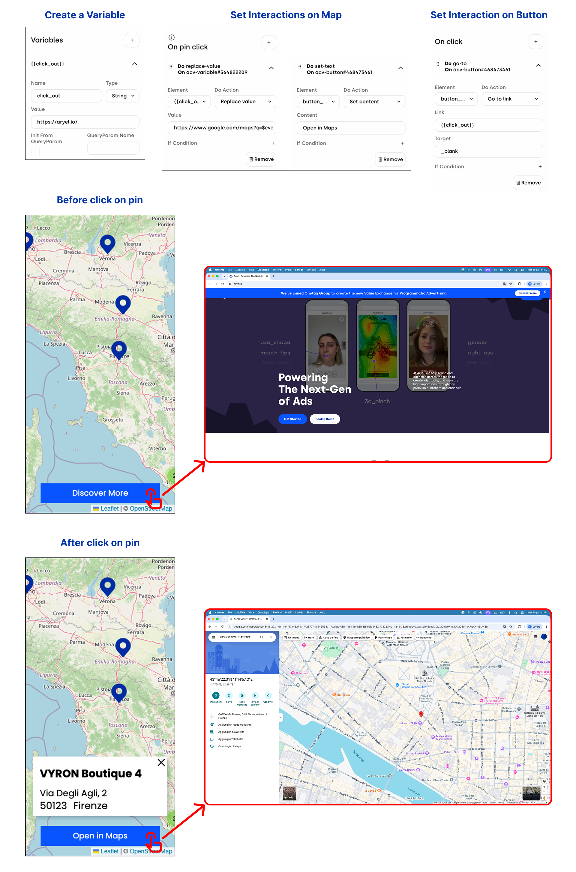
Dynamic Call-to-Action with "On pin click"
Beyond displaying information, you can create dynamic navigation experiences by updating a Call-to-Action (CTA) button to point directly to the coordinates of the selected store on Google Maps.
Step-by-Step Configuration:
Variable Setup: Create a dedicated variable to store the dynamic link (e.g., {{click_out}}). In the Variables panel section:
Name: click_out.
Type: String.
Value: Set the default URL (e.g., https://aryel.io/).
Add the Interactions:
In the Map component's On pin click event, add the following actions:
Action A (Updating the Link):
Element: Select your variable.
Do Action: Replace value.
Value: Enter the dynamic URL using the data table syntax: https://www.google.com/maps?q=$event.latitude,$event.longitude The system will automatically replace $event.latitude and $event.longitude with the values found in the data table row associated with the clicked pin.
Action B (Updating the Label):
Element: Select your button.
Do Action: Set content.
Content: Enter the text to display (e.g., "Open in Maps" or “Open $event.store_name in Maps").
In the Button component's On click event, add the following action:
Element: Select your button.
Do Action: Go to link.
Link: Enter the variable name, {{click_out}}.
With this configuration, the button updates in real-time with every pin interaction, serving as a precise guide to the selected store.
With its perfect blend of aesthetic flexibility and functional depth, the Map component empowers you to craft seamless geographic narratives. Whether you are highlighting a single storefront or a nationwide network, these settings provide the control required to ensure your ad experience is as functional as it is visually compelling. Use this guide as your roadmap to turning geographic data into meaningful user engagement.