When building your ads in the Ads Manager Builder, you can take advantage of CSS shorthands — a condensed way to write CSS properties that allows you to control multiple attributes with a single line of code, instead of setting them individually.
This feature is especially useful when you're looking to speed up your workflow and gain greater control over the visual presentation of your components.
Where to Use Shorthands in the Builder
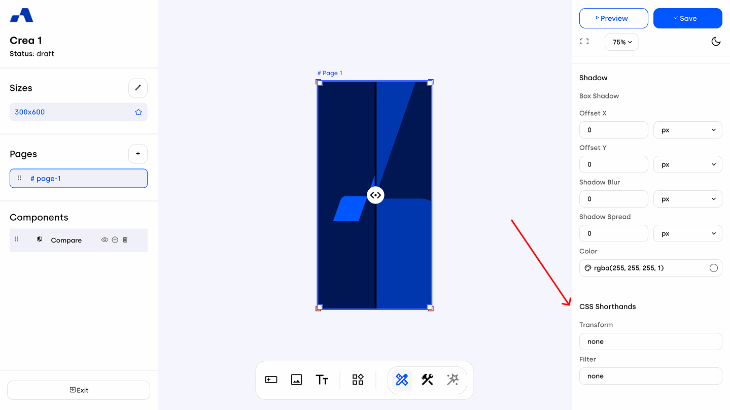
Shorthands can be applied to specific components such as Image and Layout Block.
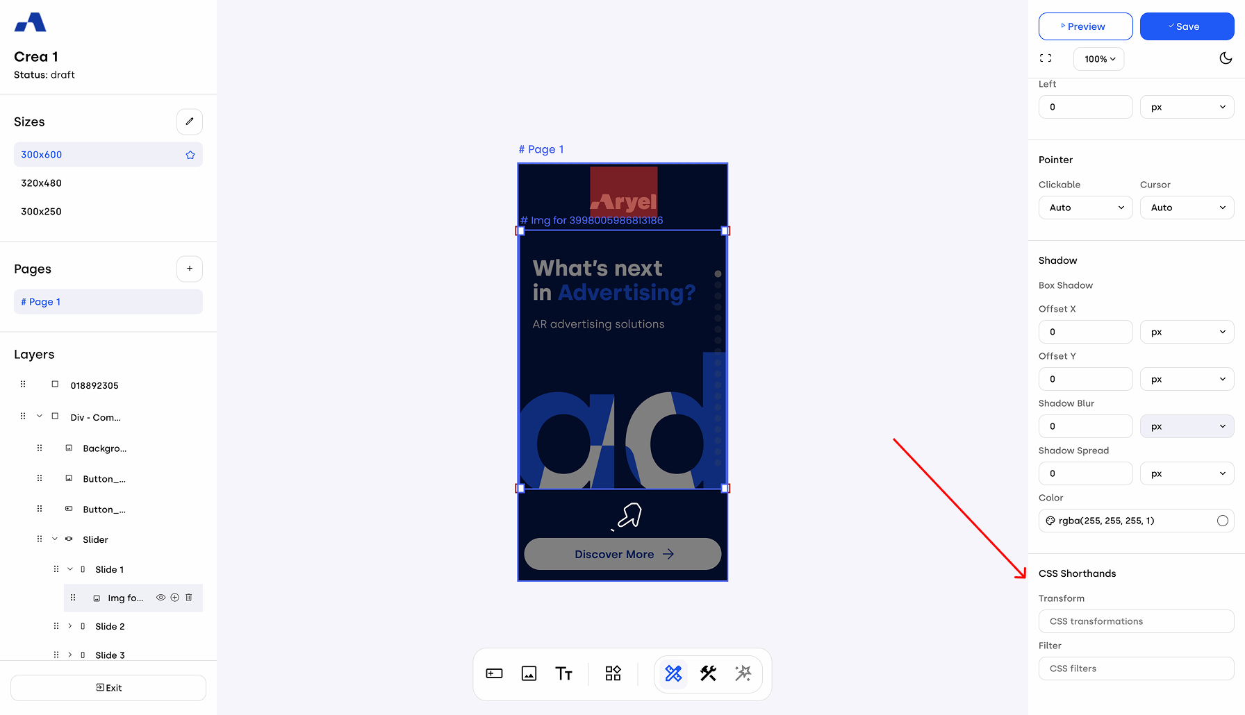
Image Component: Go to the Design tab in the right-hand panel. At the bottom of the attribute list, you’ll find the Shorthands section, with two input fields:
Transform: This field lets you apply geometric transformations such as scaling or rotating.
Filter: This field is for visual effects like blur, brightness or contrast.
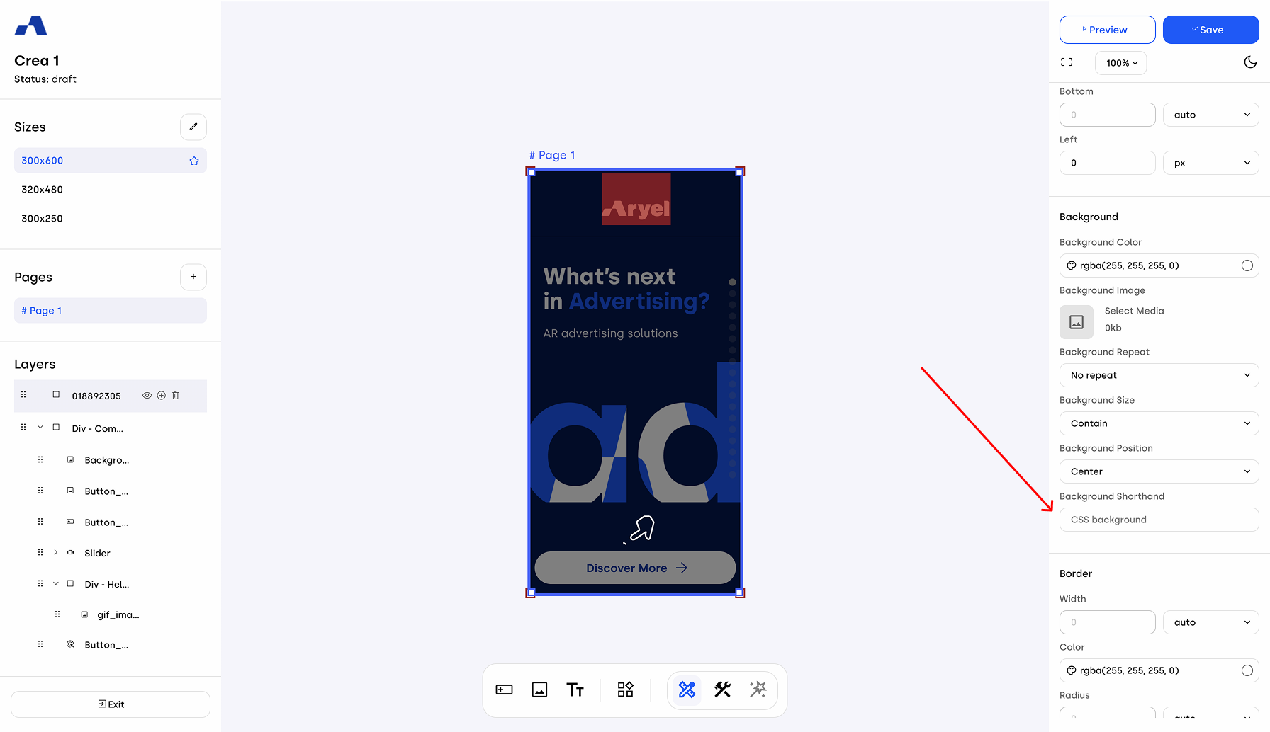
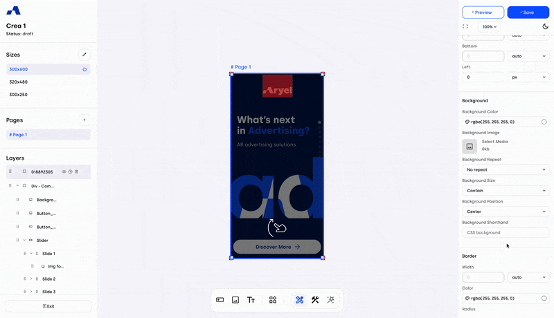
Layout Block: In the Design tab under the Background attribute section, you’ll find an input field for shorthands that allow you to manage the gradient.
It's also possible to insert more than one shorthand in the same input field — just separate each statement with a space.
Peep Component
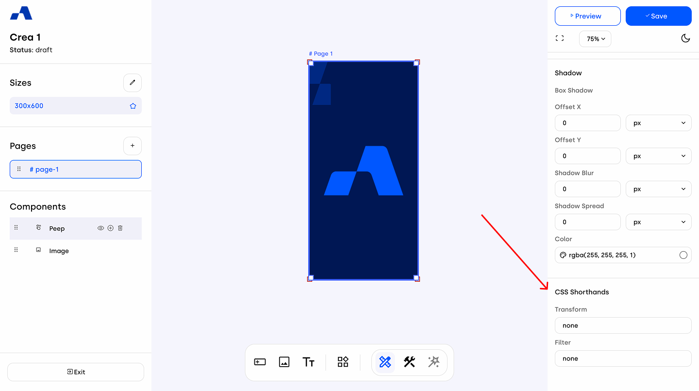
To apply shorthands to the Peep component, go to the Design tab in the right-hand panel. At the end of the attribute list, you’ll find the Shorthands section, which includes the Transform and Filter input fields. These fields work in the same way as they do for the Image component, allowing you to apply visual effects and transformations to the Peep cover.
Compare Component
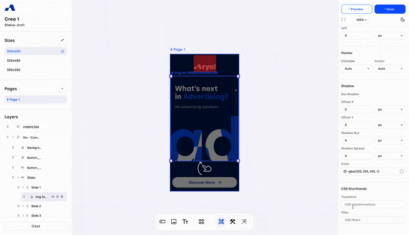
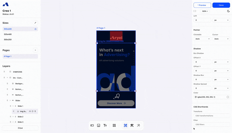
For the Compare component, shorthands can be applied to different elements. In the Design tab of the right-hand panel, within the Handle section, you’ll find an input field for background shorthands, which allows you to customize the appearance of the handle.
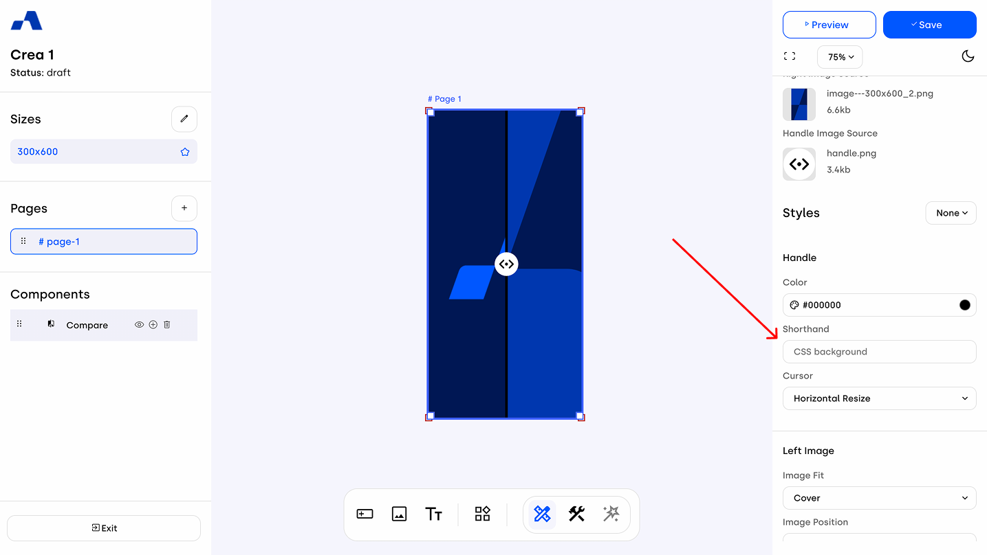
Scrolling to the end of the settings panel, you’ll also find the Filter and Transform shorthand input fields, which can be used to apply additional visual effects to the component.
Useful CSS Shorthands You Can Use in Your Creatives
Transform Shorthands
Rotate Asset: Rotates an element around its center or specific axis. You can use degrees (deg) or fractions of a full rotation (turn), and apply them to different axes. Examples:
rotate(180deg)

rotate(0.25turn)

rotateX(10deg)

rotateY(10deg)
Scale Transformations: Allows you to resize components horizontally and vertically. You can define scale for individual axes (X, Y) or together. If used with a negative value such as scaleX(-1) or scaleY(-1), it enables flipping the image on that axis.
Examples:
scaleX(2)

scale(1.3, 0.4)

scaleX(-1)

scaleY(-1)
Filter Shorthands
Blur: Softens the visual appearance of an image, often used to create focus or suspense, pushing users to interact to reveal the content. Examples:
blur(4px)

blur(1.5rem)Brightness: Adjusts how bright or dark an image appears. Increasing the value makes it brighter, lowering it makes it darker. Example:
brightness(60%)Drop Shadow: Adds a shadow effect behind the element, helping to create depth or highlight important components. The drop-shadow shorthand lets you control various aspects such as position, blur radius, and color of the shadow.
It accepts two or three values:
The first two are the offset-x (horizontal offset) and offset-y (vertical offset). For example, a negative offset-x moves the shadow to the left of the element, while a negative offset-y moves it above. If a third value is provided, it acts as the standard deviation for the Gaussian blur function. This controls how much the shadow is blurred — larger values produce softer, more diffused shadows. Note that negative values for this parameter are not allowed. Examples:
drop-shadow(4px 4px 10px blue)

drop-shadow(-5px -5px red)Grayscale: Removes color from the image, turning it black and white. It's useful for stylizing content or putting emphasis elsewhere. Example:
grayscale(60%)Hue-Rotate: Rotates the color spectrum, allowing for creative color changes without needing to alter the original asset. You can express the degree of rotation in deg or turn. Examples:
hue-rotate(-180deg)

hue-rotate(0.5turn)Invert: Reverses the colors of the image, which can be used for highlighting or visual emphasis. The percentage controls the level of inversion. Example:
invert(70%)Saturate: Controls how vibrant the image colors are. Increasing the percentage makes colors more vivid, decreasing dulls them. Example:
saturate(50%)Sepia: Useful for applying a warm, vintage tone to images by shifting colors to a more yellow/brown palette — ideal for stylistic or nostalgic visual effects. Example:
sepia(90%)Gradient on Layout Block
These shorthands are ideal for managing background styling. Gradients can be either linear or radial, giving you flexible control over how colors blend across a background. For radial gradients, you can specify the shape as either a circle or ellipse, depending on the visual effect you're aiming for. You can also manage the gradient's transition by setting percentage values that define where each color starts and ends. For example, 0% marks the beginning of the layout block, 50% represents the middle, and 100% the end, giving you full control over the gradient flow.
Examples:
linear-gradient(rgba(255, 255, 255, 0) 0%, rgba(255, 255, 255, 0.8) 100%)

linear-gradient(red 0%, orange 25%, yellow 50%, green 75%, blue 100%)

linear-gradient(to left, #333333, #333333 50%, #eeeeee 75%, #333333 75%)

radial-gradient(circle, rgb(255, 255, 255) 0%, blue, green 100%)
radial-gradient(ellipse, rgb(255, 255, 255) 0%, blue, green 100%)
For the management of color values in both filter and background shorthands, you can write them using:
RGBA: e.g. rgba(255, 255, 255, 0)
Named colors: e.g. red, blue, yellow
HEX codes: e.g. #fc1c14
Using shorthands is a smart and efficient way to manage component styles — they let you quickly apply multiple attribute values in a single move, keeping your workflow fast and flexible.