The Layout Block is an extremely versatile component used across your creatives. One of its core functions is grouping multiple components in a clean and organized structure. It is also particularly effective for creating tap-and-hold interactions, as well as supporting many other interaction-driven creative experiences.
Adding a Layout Block Component
You can add the Layout Block component in two different ways:
From the left sidebar, click the + Add Component button, select Layout Block from the type dropdown, and assign it the desired name.
From the central toolbar, click the Layout Block icon and then place the component directly onto the page by clicking inside the page.
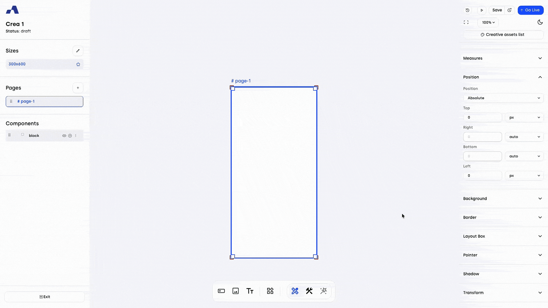
Once added, the Layout Block component will appear in the Layers section and can be selected and configured like any other component. The Layout Block can also act as a parent container for other components with a child relationship, meaning child components inherit certain properties from the Layout Block. For example, if the Layout Block is set to hidden, all underlying child components will be hidden as well.
Right Sidebar Configuration
When the Layout Block component is selected, the right sidebar updates to display dedicated settings specific to this component.
Design Tab
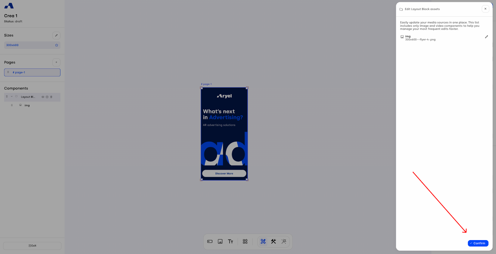
Edit children assets: This option allows you to quickly change the source files for all the images and videos included in the layout block.
By clicking the pencil icon, a side panel will open displaying all the child assets contained within the layout block.
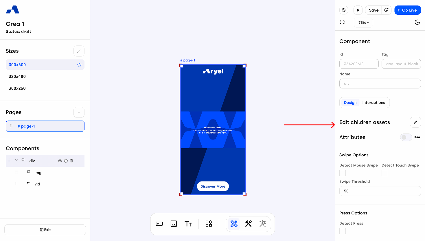
Click the pencil icon next to the specific asset you want to update to replace the source file for each available size with another asset from the library.
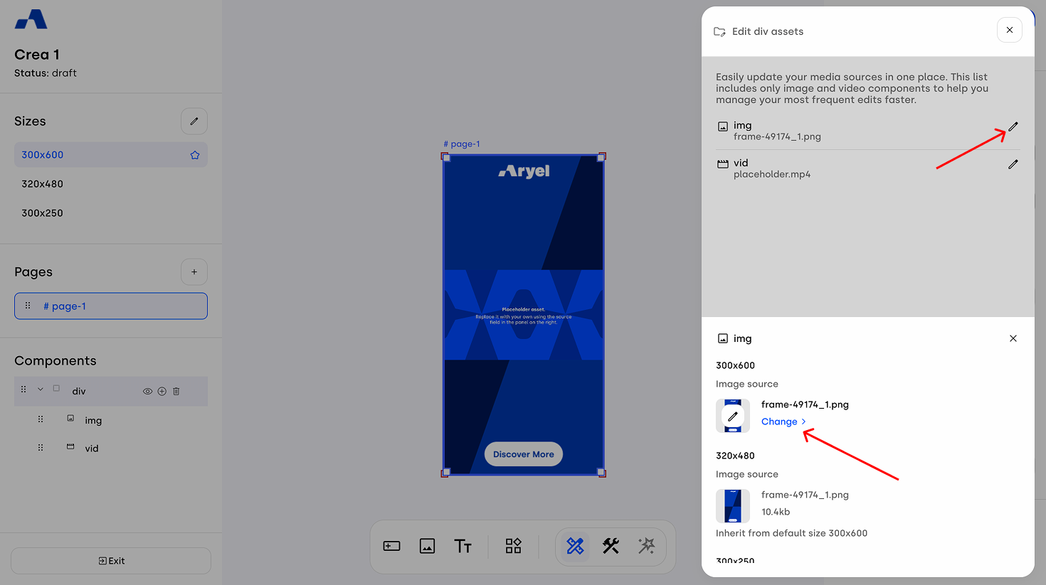
Once you have made your desired changes, click Confirm to apply them all at once.
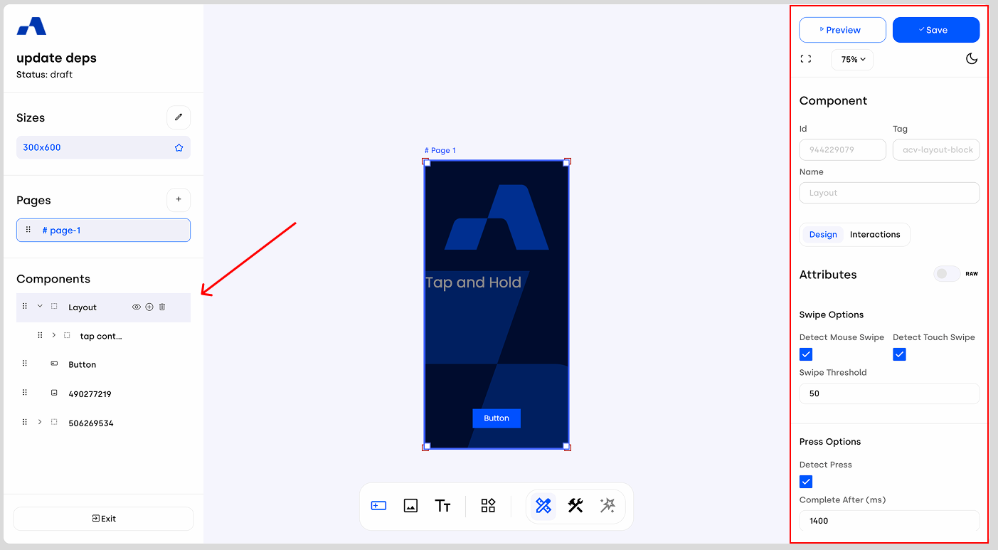
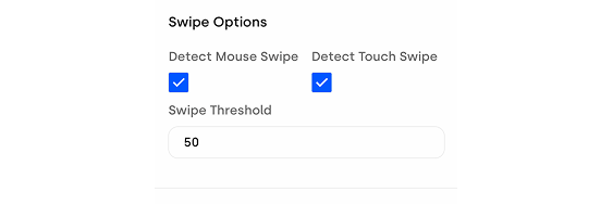
Swipe Options
Detect Mouse Swipe: Enables swipe recognition for mouse-driven gestures, allowing users to drag and swipe using a cursor.
Detect Touch Swipe: Enables swipe recognition for touch gestures on mobile or touchscreen devices.
Swipe Threshold: Defines the minimum swipe distance required for the gesture to be recognized and triggered.
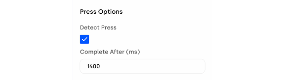
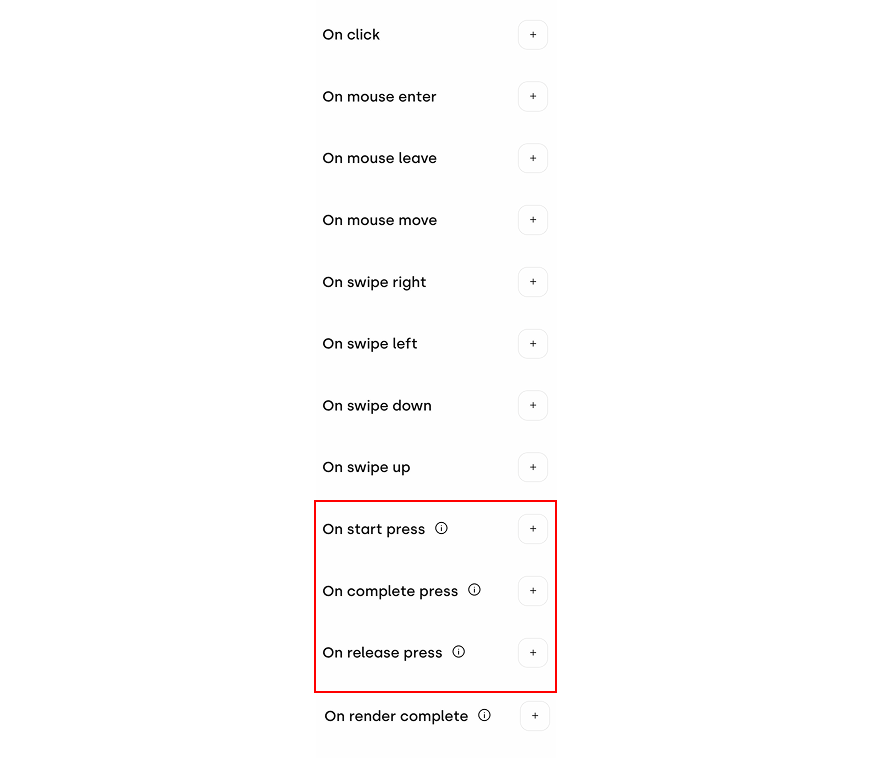
Press Options
Detect Press: Enables press detection, allowing you to trigger interactions when the user taps and holds on the component.
Complete After (ms): Defines how long the user must keep the press active for the action to be considered completed.
Styles Section
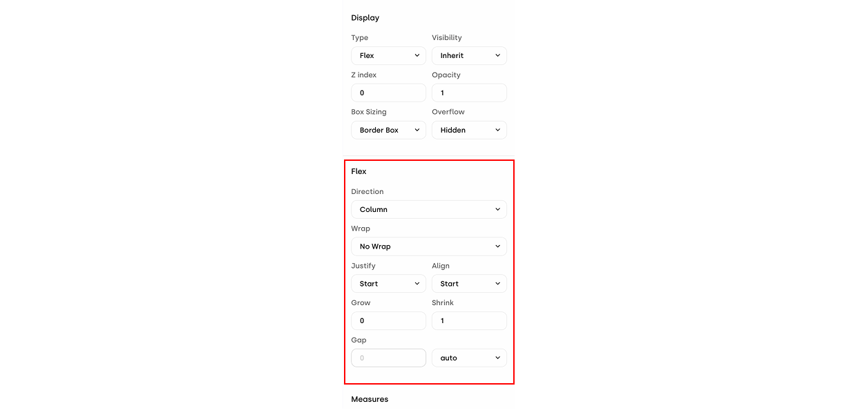
Scrolling further, you’ll find the style settings available for the Layout Block component, where you can customize its appearance and layout properties.
Within the Display section, if you select Flex as the Type attribute, an additional configuration area will appear inside the Design tab. This section allows you to manage all Flex-related properties, including:
Direction: Defines whether elements are arranged in a row or a column.
Wrap: Defines whether elements are wrapped and in which order.
Justify: Aligns elements along the main axis (for example, vertically when using column).
Align: Aligns elements along the secondary axis (for example, horizontally when using column).
Grow: Determines whether elements are allowed to expand.
Shrink: Determines whether elements are allowed to shrink.
Gap: Defines the spacing between elements.
Within the style options, a dedicated Background section allows you to define a background color or apply a background image. The management of the background source is seamless:
Add: When no image is set, hovering over the Background Image block reveals a pencil icon and the "Select >" label. Clicking here opens the library to upload or choose your asset.
Change: If an image is already applied, hovering over the block displays the pencil icon and the "Change >" label, allowing you to quickly swap the current asset.
Delete: When an image is already applied, hovering over the Background Image area reveals an 'x' icon on the far right side of the section. Clicking this icon instantly removes the applied image, returning the field to its empty state.
You’ll also find additional settings to control how the background is displayed, along with an input field where you can insert background shorthands.
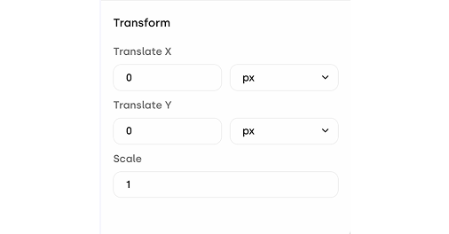
At the end of the right sidebar, you’ll also find Transform fields, preconfigured to support translations on the X axis, the Y axis, or both. You can also manage scaling to adjust the overall size of the component.
Interactions Tab
In the Interactions section, you can define how the creative behaves in response to the different actions a user can perform on the ad.
When the Detect Press checkbox is enabled, this section updates to display additional interaction options specifically designed to manage the different behaviors associated with tap-and-hold interactions.
The Layout Block offers multiple ways to structure your ad and build interaction-driven experiences. Exploring its gesture and styling options will help you understand its full potential and integrate it effectively into your creatives.