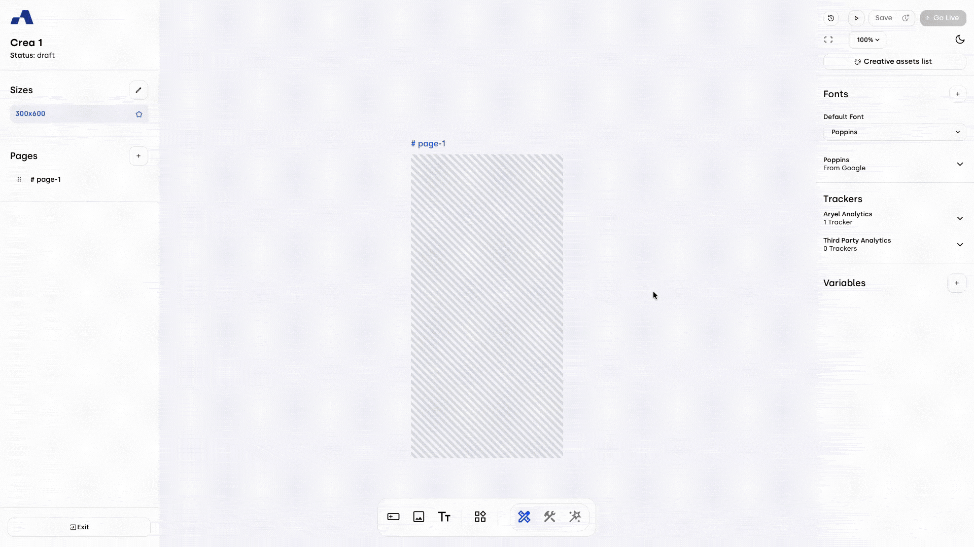
The Creative Builder is the tool that lets you create and edit your creatives with complete autonomy. It’s designed to be simple and intuitive, so you can focus on building without distractions. The layout is divided into three main areas: the left sidebar, the central workspace, and the right sidebar.
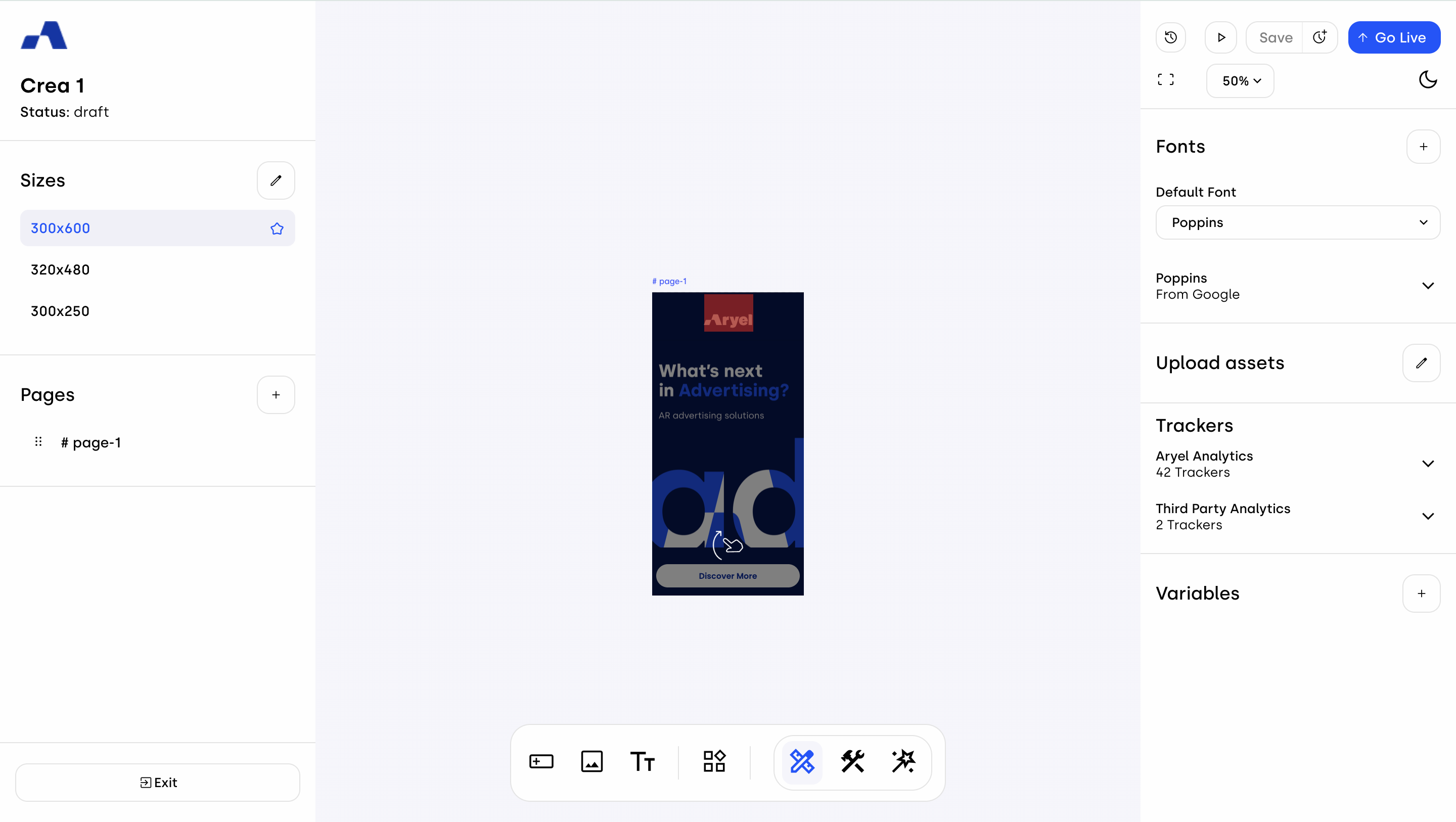
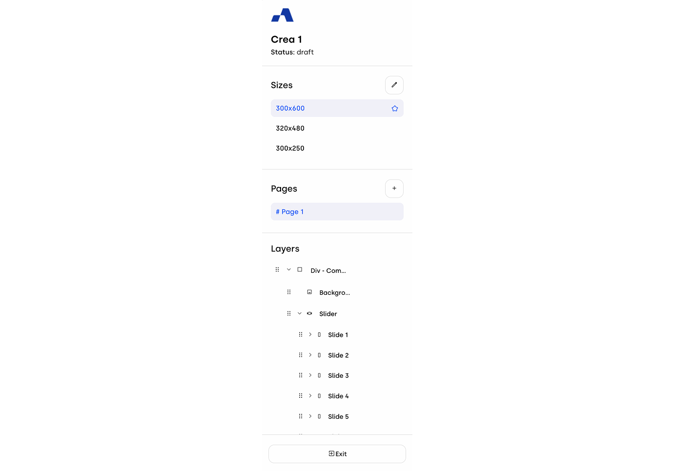
Left Sidebar
The sidebar on the left is organized into four main sections, each designed to support a different step of your workflow:
Header Section
At the top, you’ll always see the name and status of your creative.Size Management
In this section, you can view all the sizes available for your creative. By clicking on a size row, you can change the canvas view to display the selected size. The default size is marked with a star — initially set to 300x600 — and by clicking the pencil icon, a modal will open allowing you to add or delete any size, or define the default size. The ability to manage sizes is available in Designer Mode only.Page Management
Every creative starts with a default page. From here, when in Designer Mode, you can add new pages by clicking the “+” button below the page list, making it easy to build multi-page creatives. When multiple pages are present, you can reorder them according to your preferred sequence.Layers & Components
This section - not available in Wizard Mode - shows all the components (layers) included in the selected page. If the page is empty, you’ll see a button that guides you to start adding components right away. When components are present, and you are in Designer Mode, you can also reorder them to achieve a clearer view of their hierarchy and structure.Exit Button
Finally, at the bottom of the sidebar, there’s the Exit button, which takes you back to Ads Manager whenever you need.
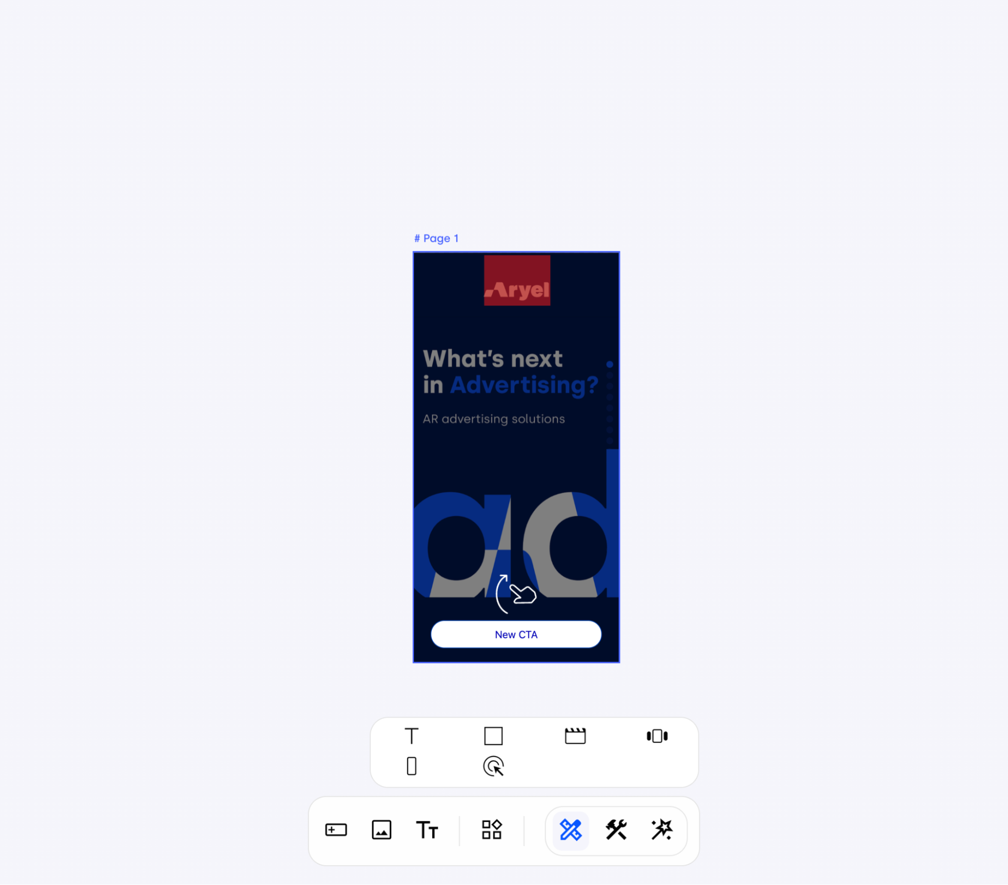
Central Workspace
This is the heart of the Builder — the area where your creative really takes shape.
At the bottom of the workspace, there’s a toolbar that features three buttons allowing you to switch between the different Builder modes: Designer, Blueprint, and Wizard (learn more about these modes by reading this article).
Additionally, when working in Designer Mode, you can add new components directly from the toolbar. The available assets include Buttons, Image, Rich Text, Text, Block Layout, Video, Slider, Slide, and Click Area.
Right Sidebar
The right sidebar updates dynamically, first and foremost based on the mode you’re using — whether Designer, Blueprint, or Wizard.
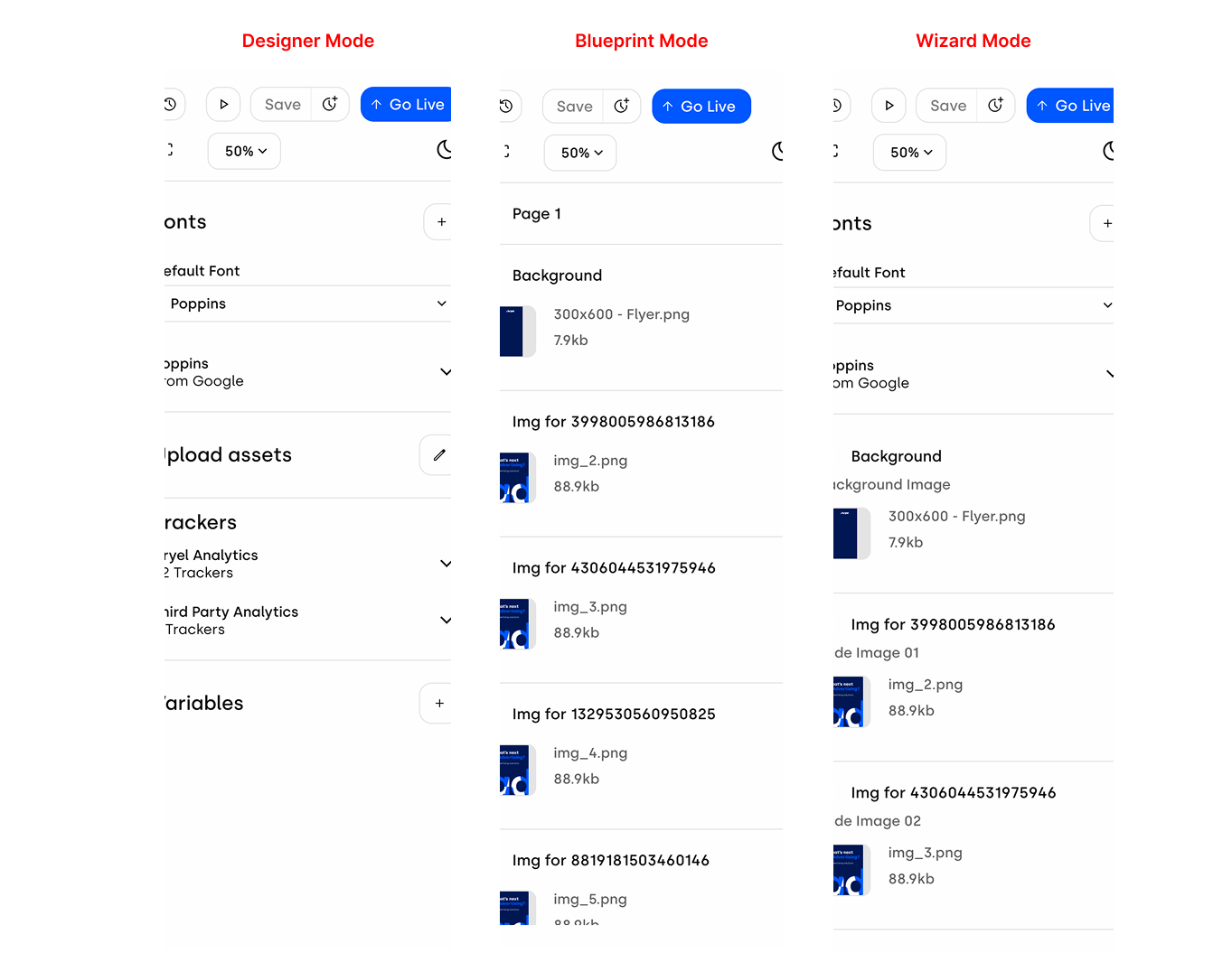
The Blueprint Mode sidebar provides two distinct views. When a component is selected, you can define which attributes should be available in Wizard Mode. Once the component is deselected, the sidebar displays the previously selected attributes, allowing for easy review.
The Wizard Mode sidebar displays all the components selected in Blueprint Mode, along with their respective editable fields, ready for adjustment.
Finally, the Designer Mode sidebar adapts dynamically, presenting different configurations depending on what you select within your workspace:
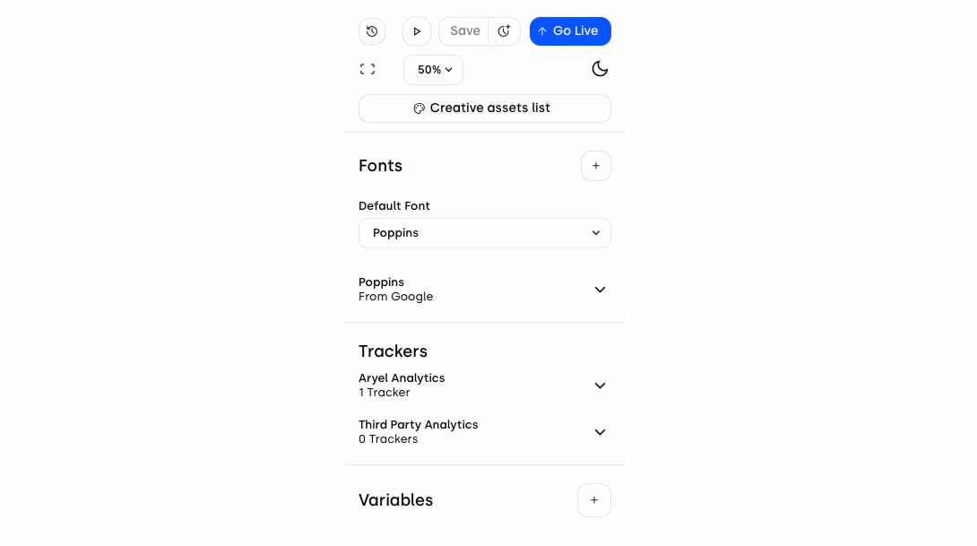
When nothing is selected
You’ll see general properties for the whole creative:
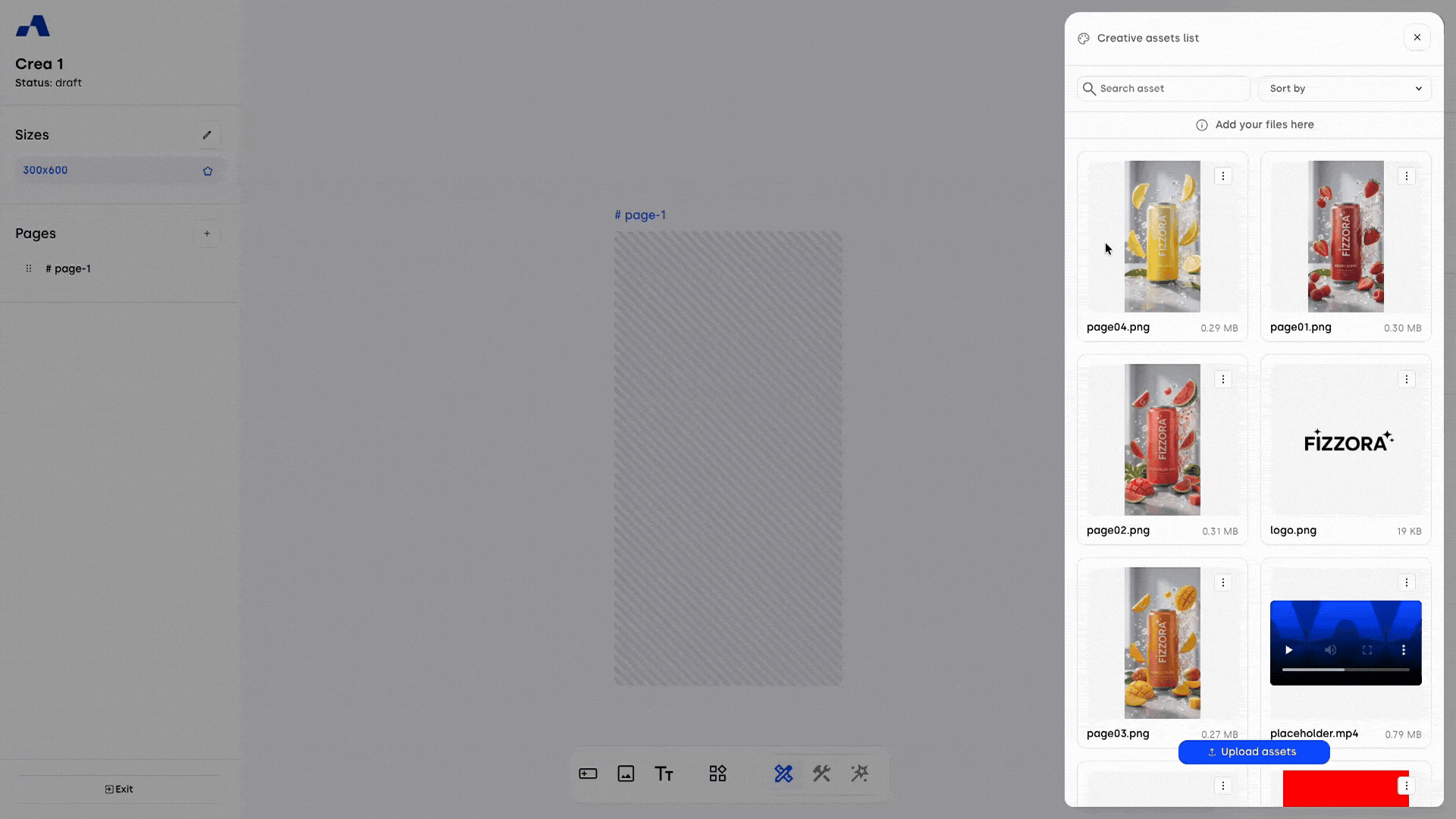
Creative assets list: Opens a panel that allows you to manage the creative's assets. The panel displays clear format guidelines and weight limits at the top.
Importing files: The upload flow allows you to import files from your account’s Media Library or directly from your local device.
Handling duplicates: If there are files with the same name as those being uploaded, a message will prompt you to choose whether to replace them or keep both/all. In the latter case, the system will append a progressive number to the filename (e.g., page01_1, page01_2).
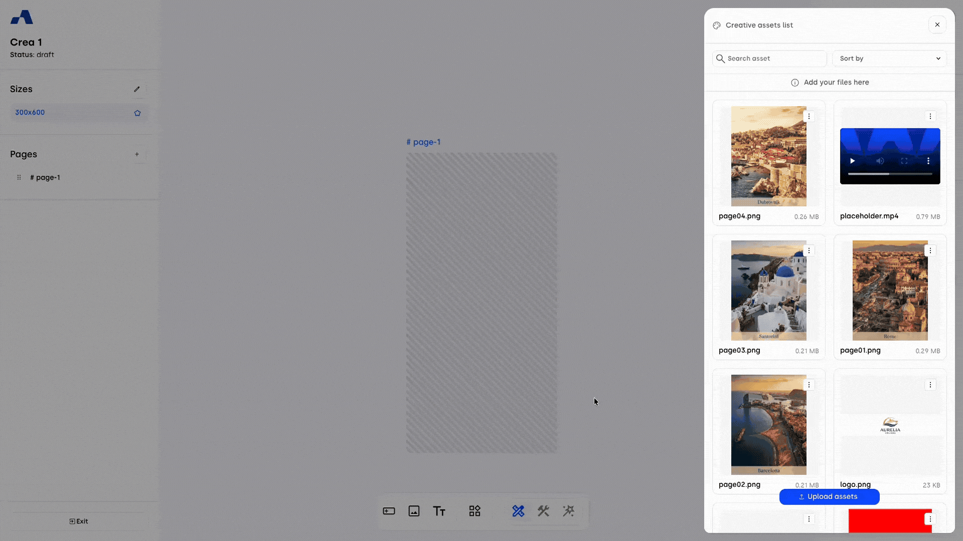
Asset view: Each asset is presented as a file tile with a preview, name, and size.
Usage indicator: A clear visual label ("In Use" badge) is applied above the thumbnail of any file currently being used in the creative.
Protection: For any file marked as "In Use," the system prevents it from being deleted.
Quick actions: A kebab menu provides quick Download and Delete actions (where permitted).
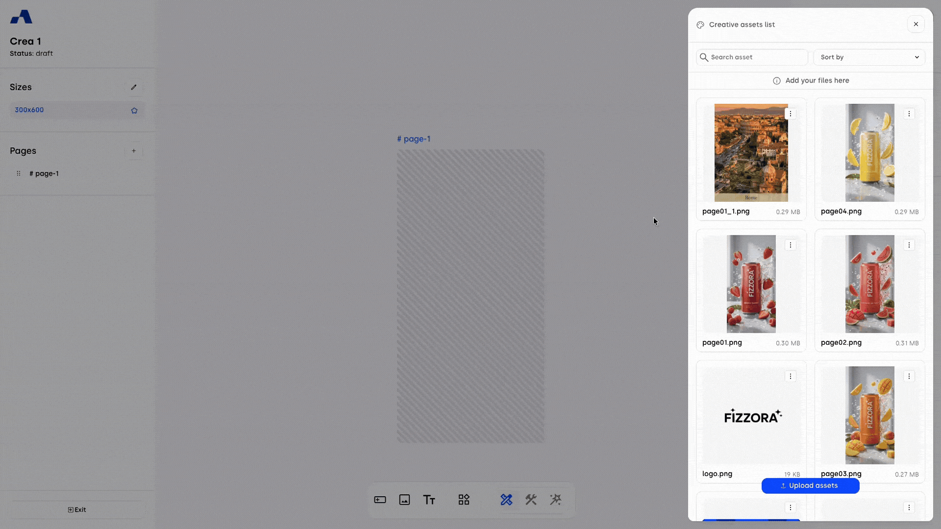
Sorting and filtering: The list defaults to "Most Recent" sorting, but you can change the order using a drop-down menu (Most recent, Oldest first, Name A-Z, Name Z-A, Media type, In use). Additionally, a search input allows you to filter files by name instantly.
Fonts: Default is Poppins, but you can swap it with a Google Font URL or upload a .woff2 font.
Trackers: Manage first- and third-party trackers.
Variables: Create and edit variables for dynamic personalization.
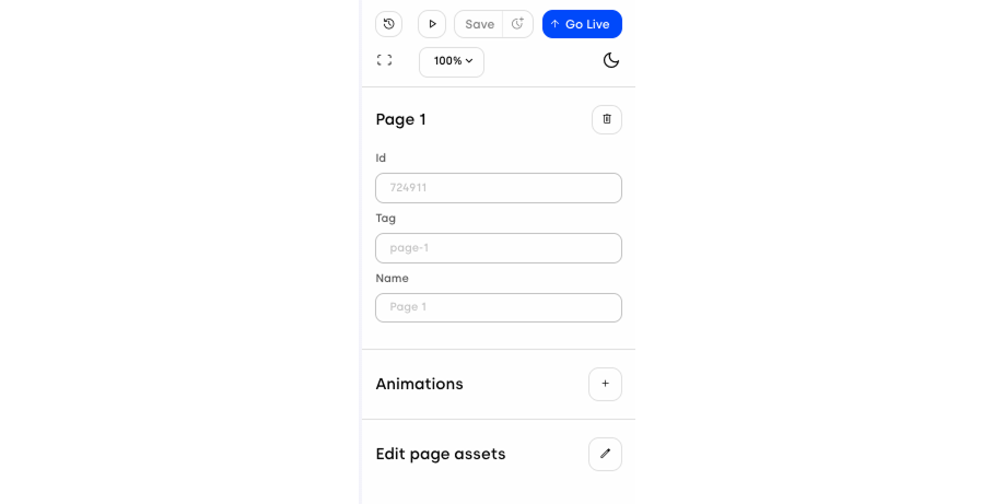
When a page is selected
The sidebar will show:
Page Information: ID, tag, and name, with an option to delete the page.
Animations: Tools to add transitions and effects.
Edit page assets: This option allows you to manage all the assets contained within the page.
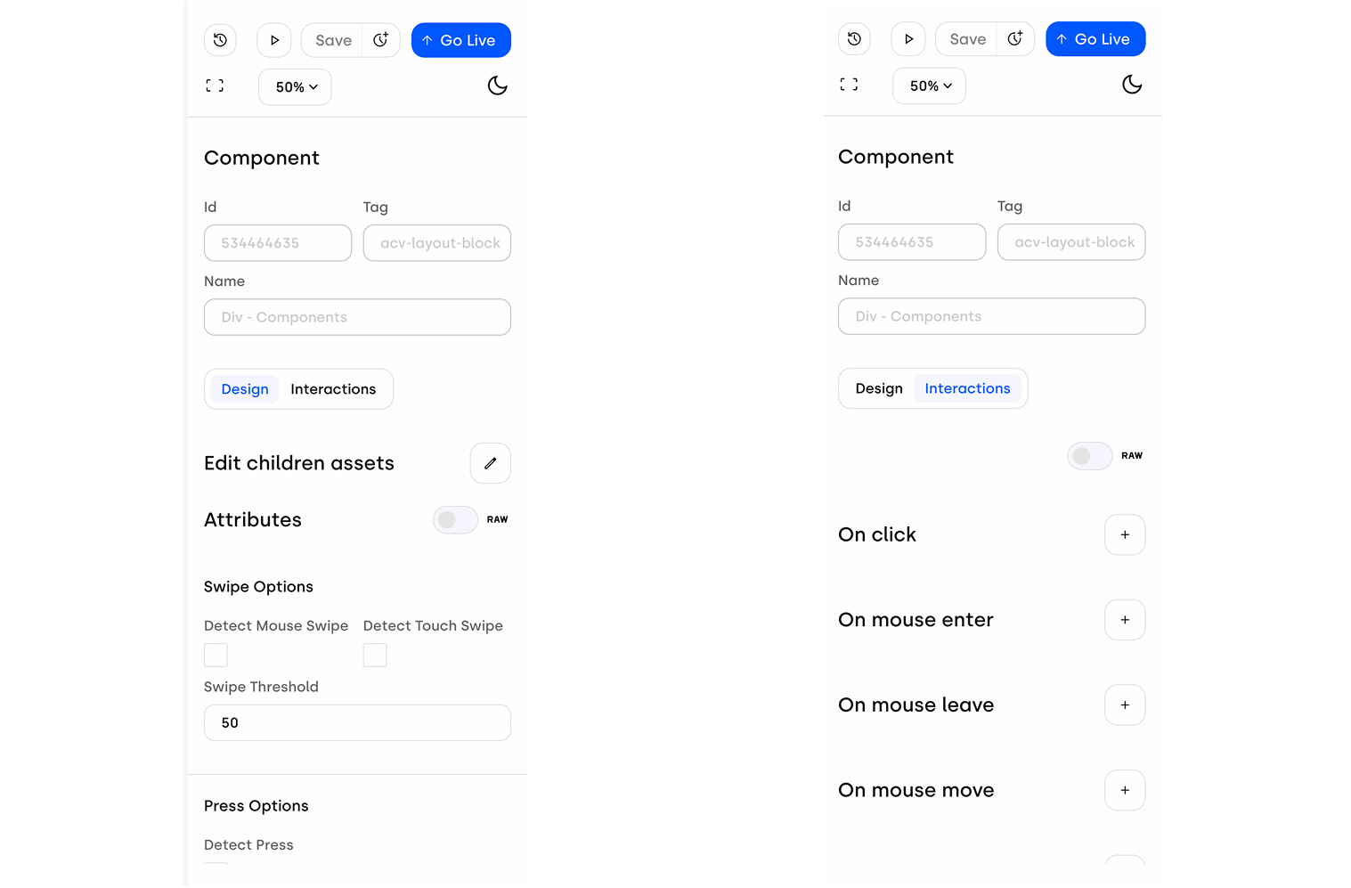
When a component is selected
You’ll see its specific settings:
Component Info: ID, tag, and editable name.
Design Tab: Adjust layout, spacing, borders, colors, and more.
Interactions Tab: Set behaviors like click or hover, and connect them to actions (on pages, components, or trackers). Available options depend on the type of component.
At the very top of the sidebar, you’ll always have:
Save: Secure your work at any time.
Version History: Access the history of your creative to view, compare, or restore previous versions.
Save Version: Create a "checkpoint" by saving a specific version of your project, making it easier to track changes over time.
Go Live: Publish the current version of your creative, making it live and effective.
Preview: Open a real-time preview of your creative in a new tab. This feature is not available in Blueprint mode.
Recenter Canvas: Quickly return the view to the center of your workspace.
Zoom Controls: Adjust your view of the workspace through a dropdown of zoom levels.
Theme Toggle: Switch between light and dark mode for your workspace.
The Creative Builder is your central space to design, manage, and fine-tune interactive ad experiences. With a clear layout, intuitive controls, and flexible options, it allows you to take care of every detail of your creatives in one place — while staying simple and easy to use.