
Interactions are a key part of building your ad experience. Through the Interaction section, available when Designer Mode is active, you can control how each component behaves based on user actions. This feature allows you to create engaging and dynamic ad experiences tailored to how users interact with your content.
You’ll find the Interactions section in the right sidebar once a component is selected. A toggle lets you switch between the component’s Design and Interactions views. The options shown in the Interactions section will vary depending on the component selected.
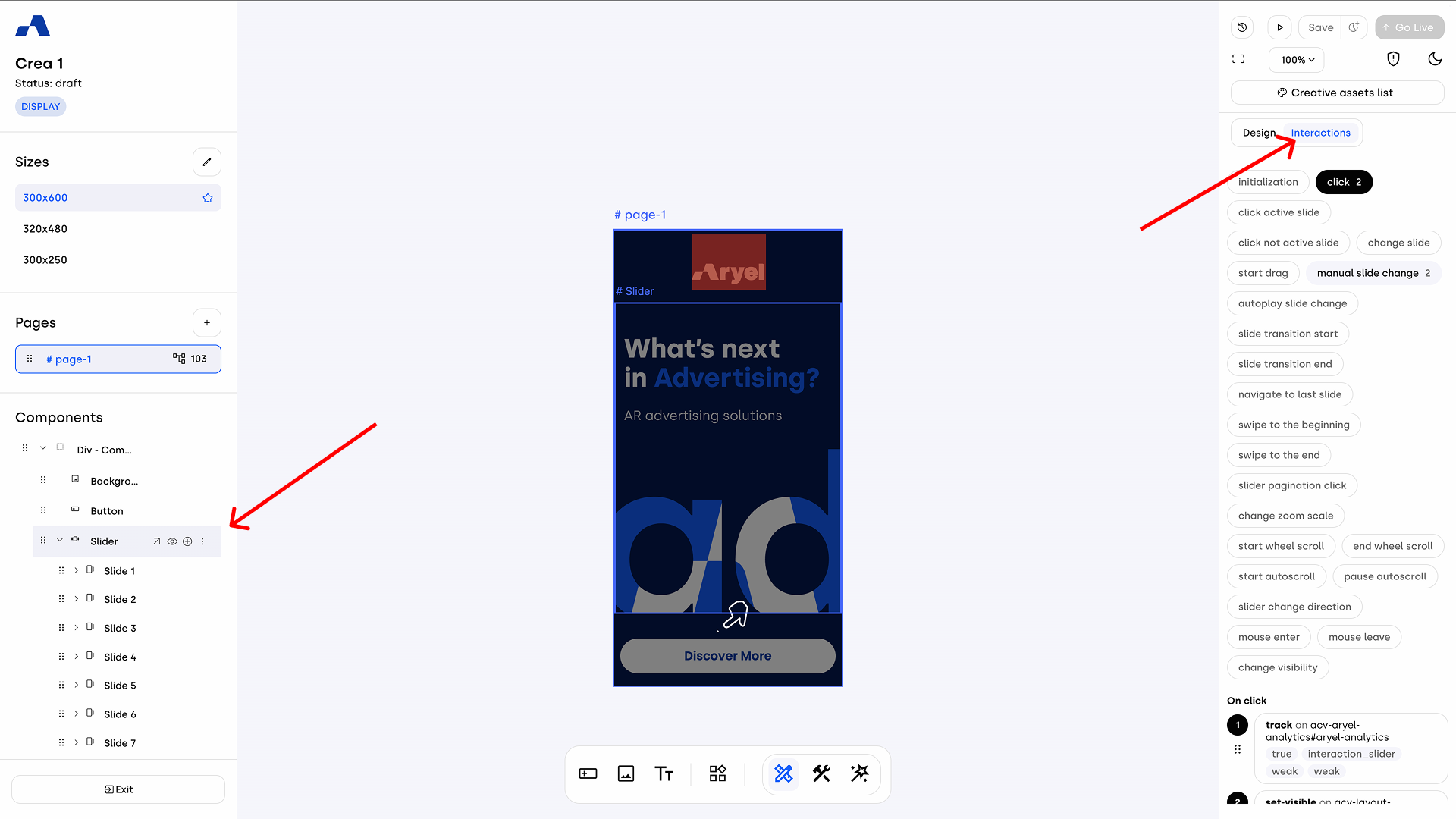
To add an interaction, first select the desired event trigger from the available grid (e.g., "click", "render complete", "mouse enter"). Once selected, a section for that event (such as "On click") will appear at the bottom of the sidebar. Click the + Add action button. An action configuration panel will open, presenting the Target settings with two main fields:
Element: Clicking this opens a dropdown menu where you can select the target of the interaction. This list includes all the components already added to the page, as well as options like Aryel Analytics, Third-Party Analytics, Pages and Variables.
Do Action: Once you select the element, this dropdown will update with all the possible actions related to the selected target. Depending on the action type, additional fields may appear to further customize the interaction.
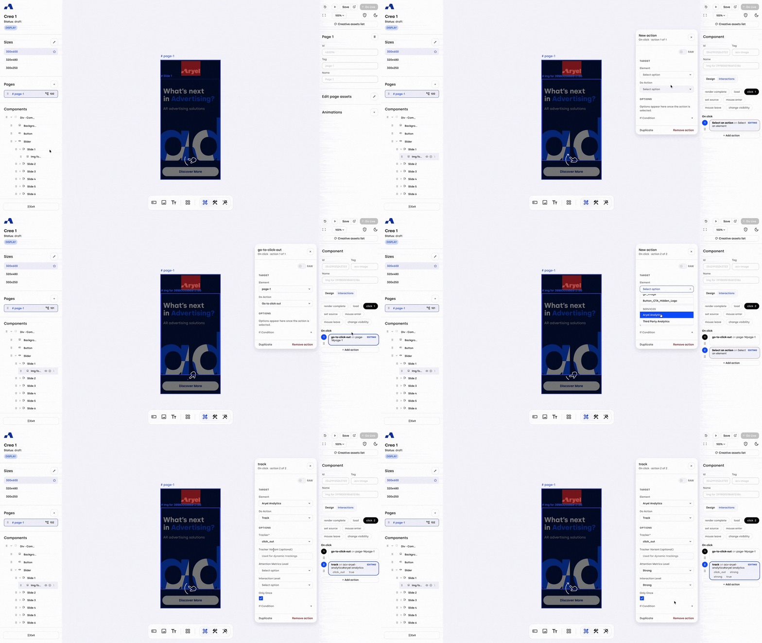
To speed up your workflow, you can easily replicate an existing setup. Inside the action configuration panel, simply click the Duplicate button at the bottom next to the remove option. This will instantly create an exact copy of that action within the same event block, allowing you to modify it without having to configure everything from scratch.
When multiple actions are present under the same event, it’s possible to reorder them by dragging them in the list. The order of actions is crucial because it determines the sequence in which the system executes them. For example, if you enable an action that hides a component and then, within the same event sequence, attach a tracker, the tracking will not be recorded since the component disappears due to the previous action.
Interactions Overview Panel
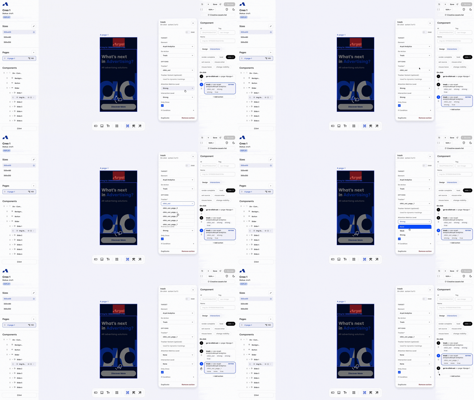
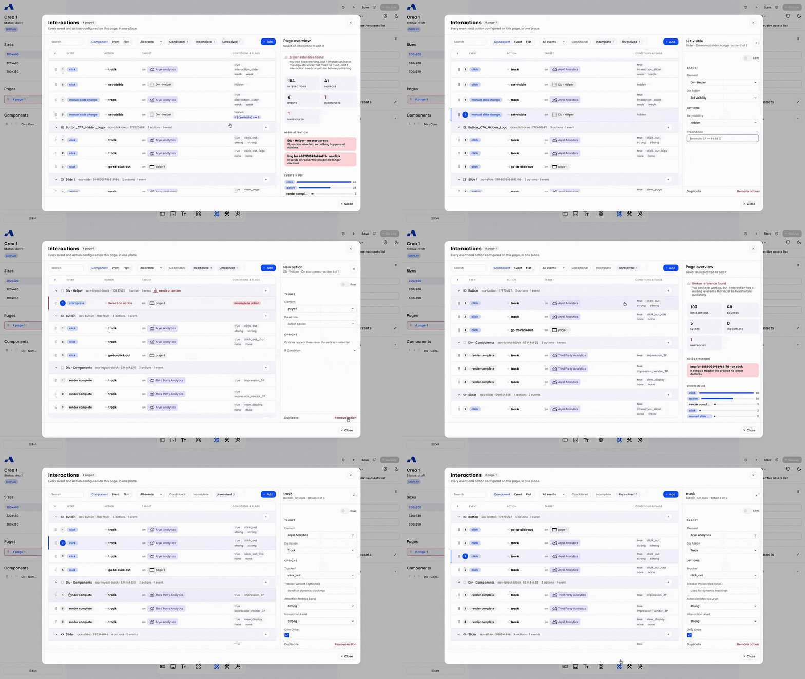
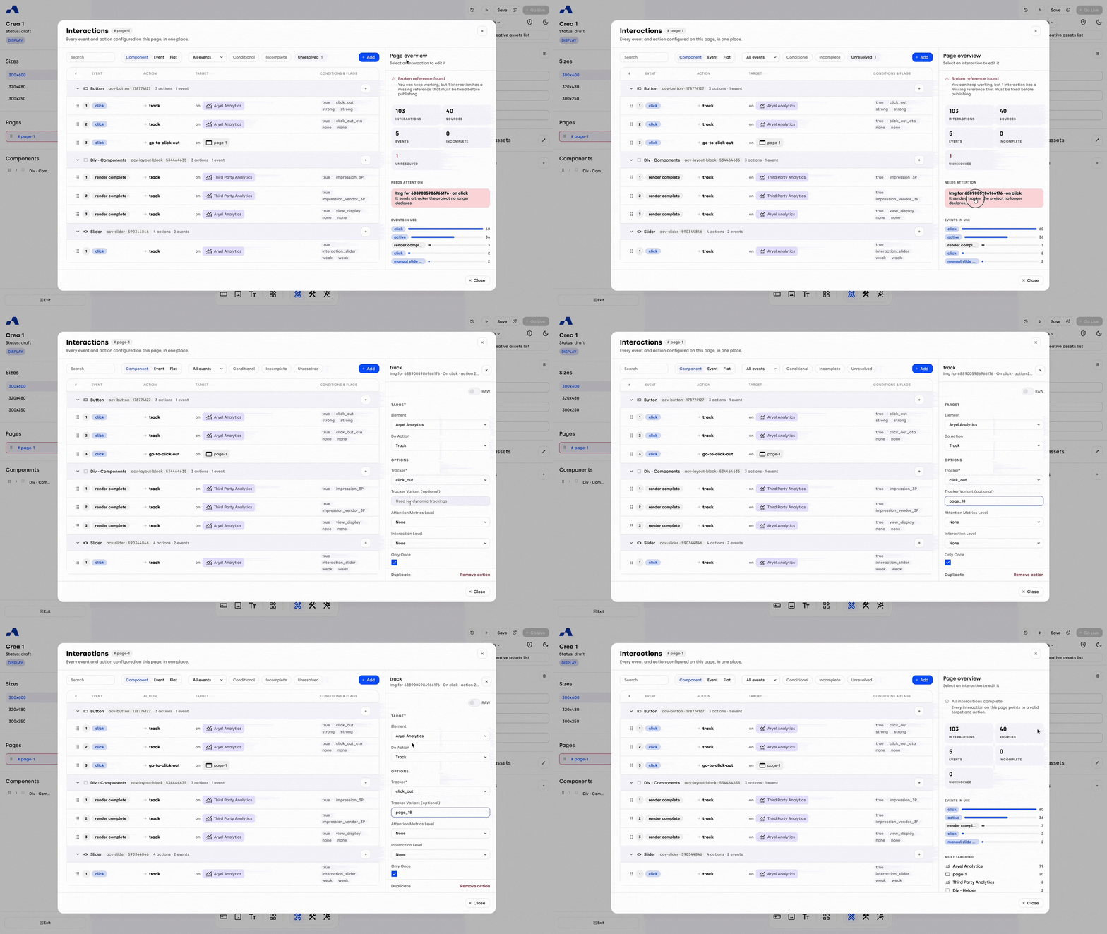
To give you complete control, you can view and manage every event and action configured on the page in one place through the Interactions Overview panel. This panel is accessible exclusively when you are in Designer Mode: simply click on the interactions icon next to the page name in the left sidebar.
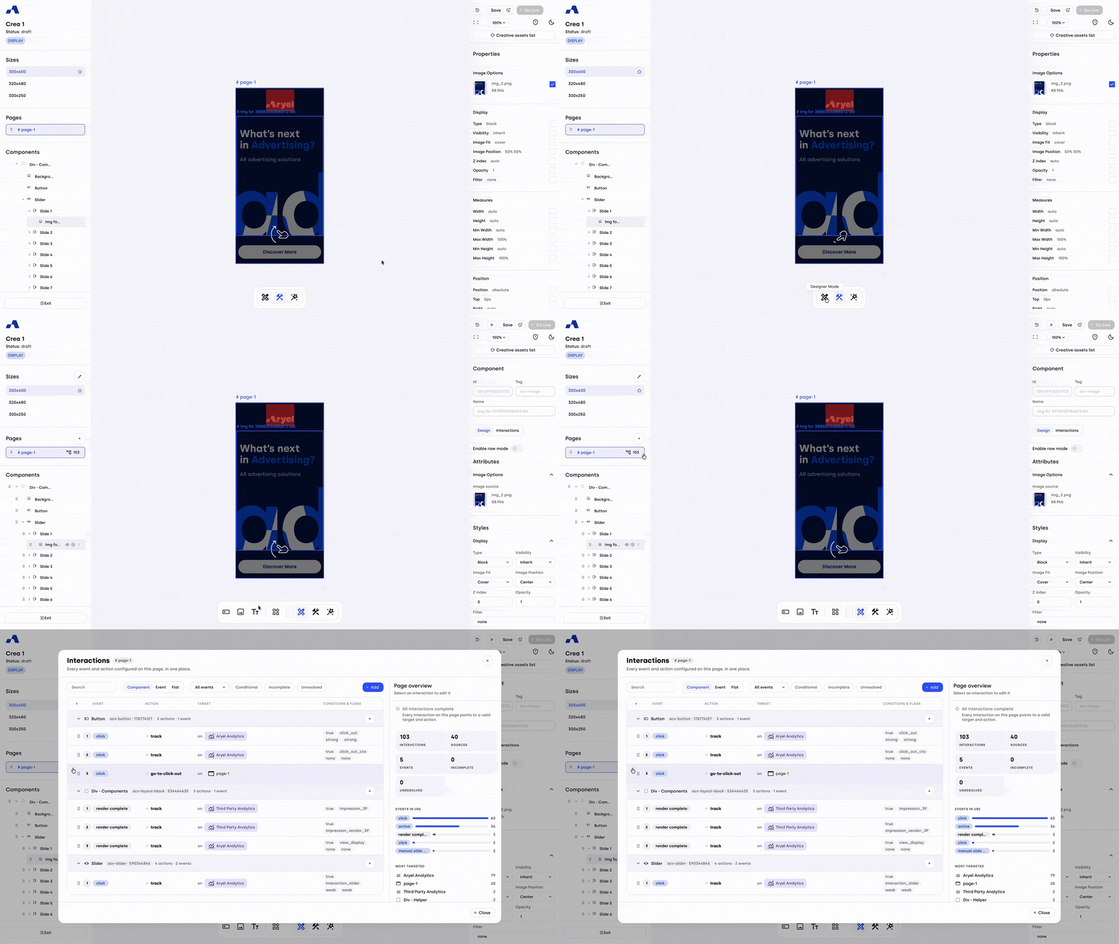
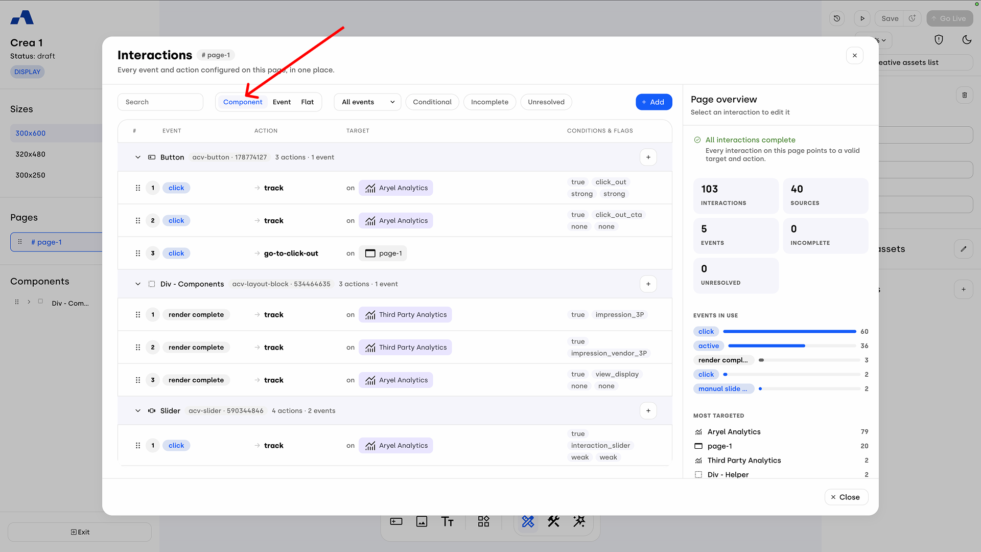
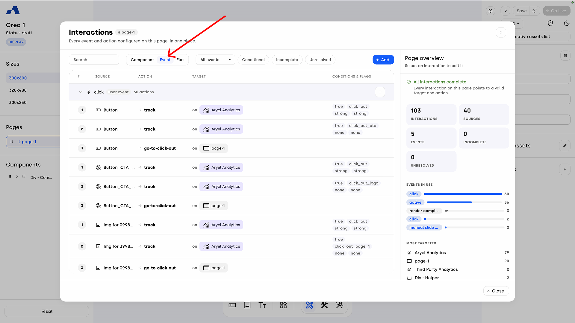
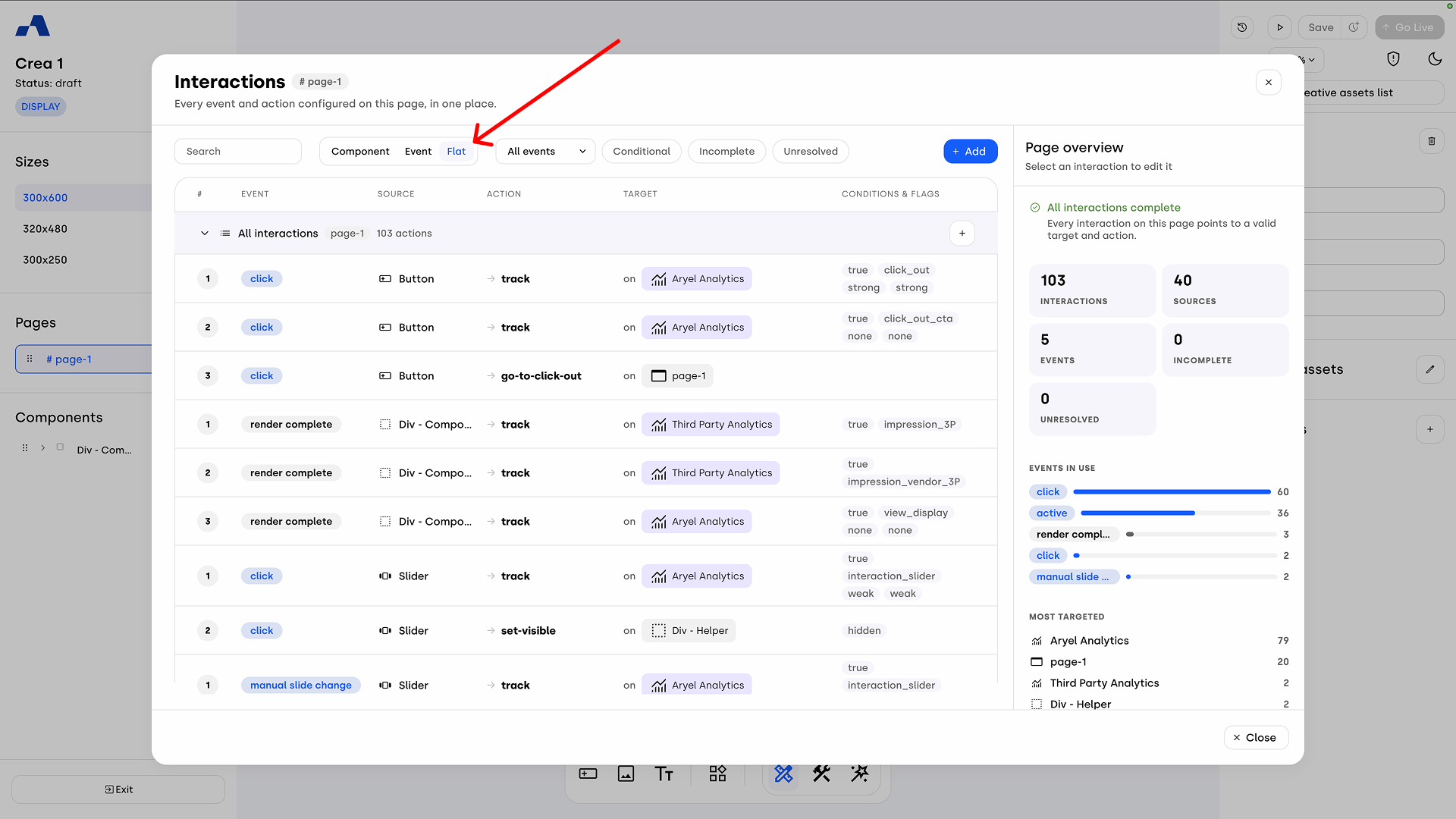
Within the Overview, you can organize the display of interactions by choosing from three different views:
Component: Groups interactions based on the component they are applied to.
Event: Groups interactions based on the type of event that triggers them (e.g., all "clicks" grouped together).
Flat: Shows a simple, linear list of all interactions without any grouping.
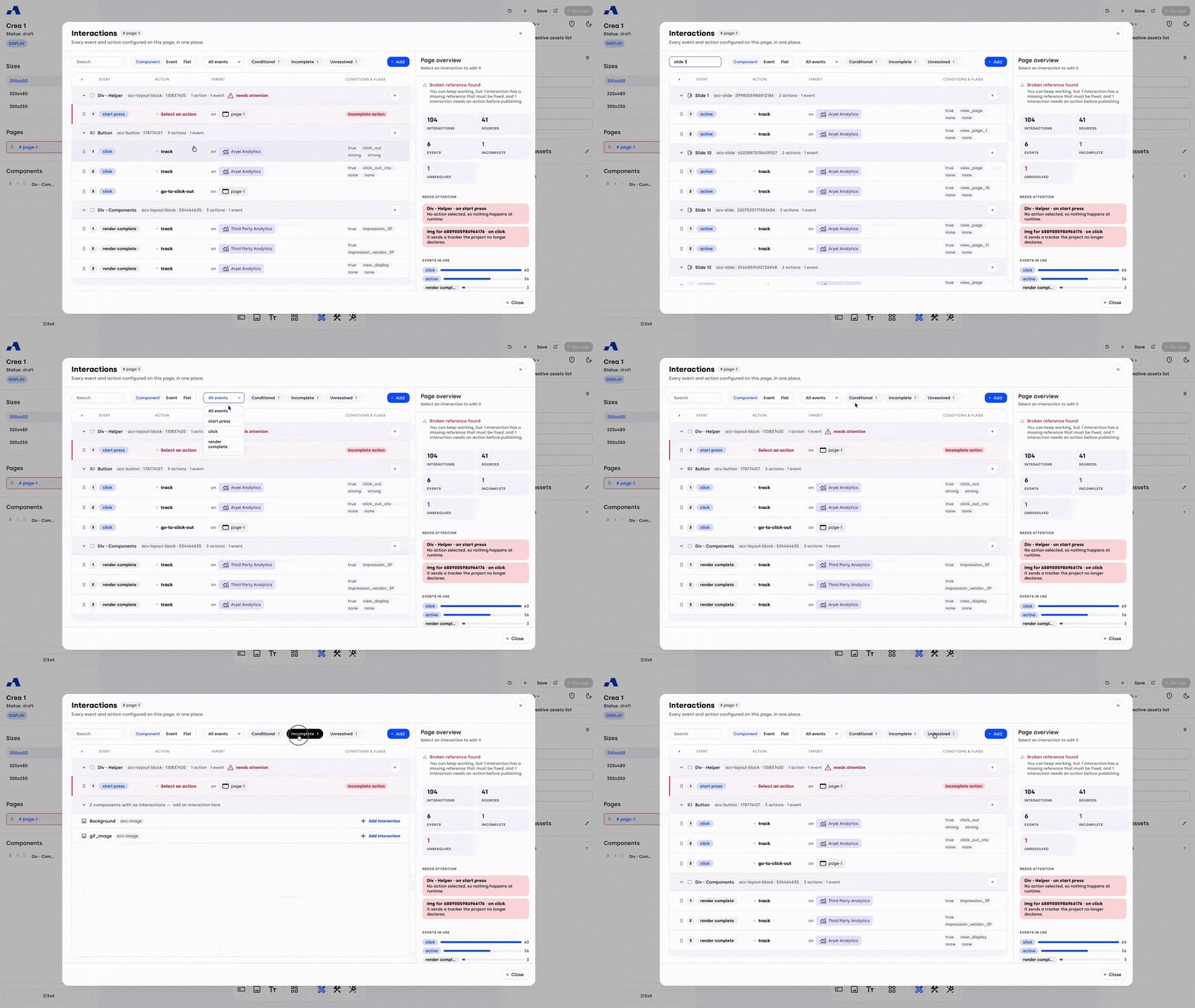
To easily find specific configurations, the panel offers several filtering tools:
A text search field.
An events dropdown menu (e.g., "All events") that lists all the events currently used on the page and allows you to filter interactions by the selected event.
Quick filters via dedicated buttons:
Conditional: Shows only interactions that contain conditions.
Incomplete: Filters incomplete interactions, such as those missing a target or an action.
Unresolved: Shows "broken" interactions. This happens when an element used in an action (such as a target component, page, animation, variable, or tracker) is subsequently deleted. The interaction remains but loses its reference and will not work at runtime.
Managing and Adding Interactions from the Panel
Directly from this panel, you can modify existing interactions (by selecting them), delete them, duplicate them, or reorder the actions.
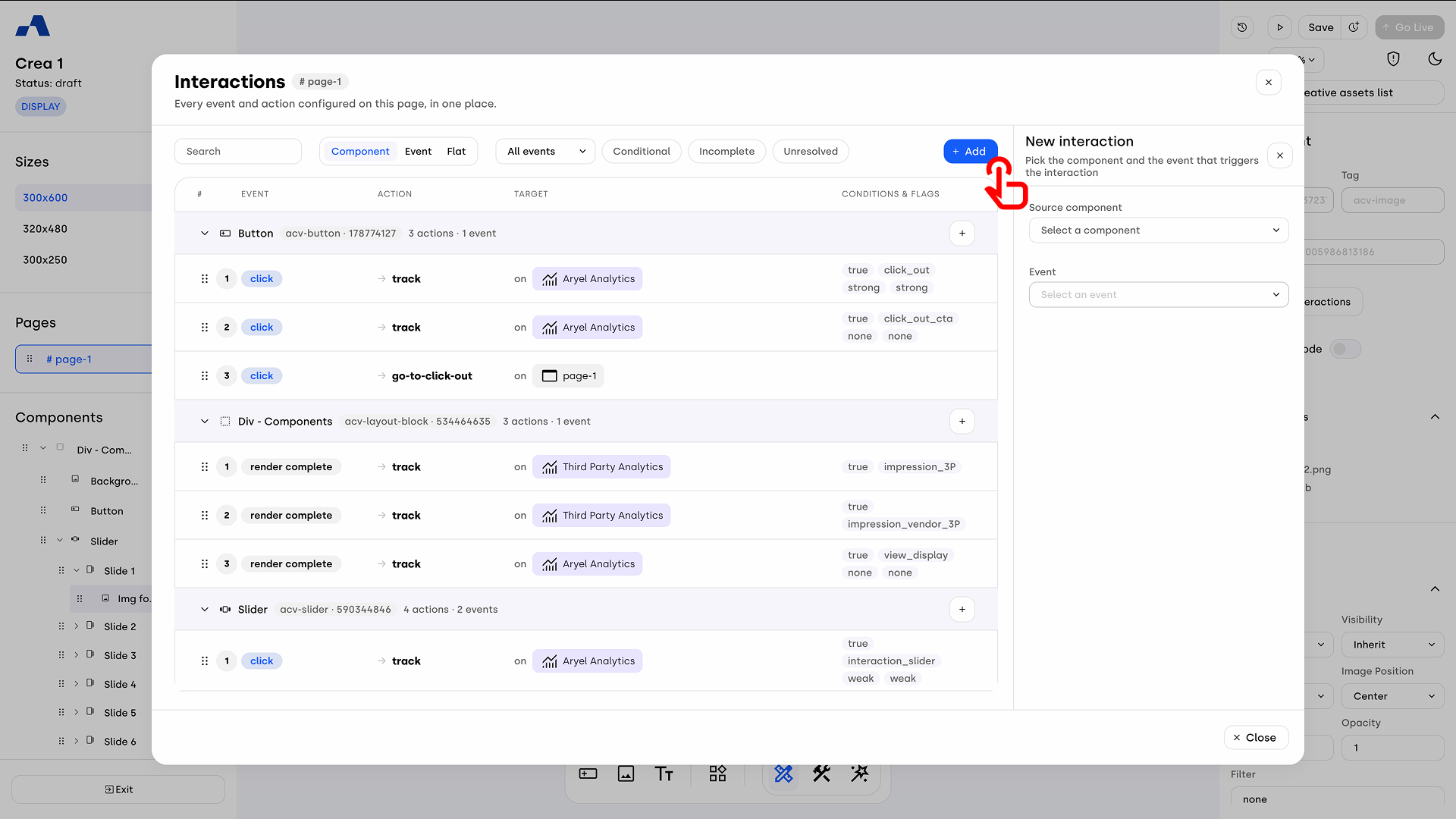
You can also add new interactions in several ways:
By pressing the blue + Add button in the top right corner.
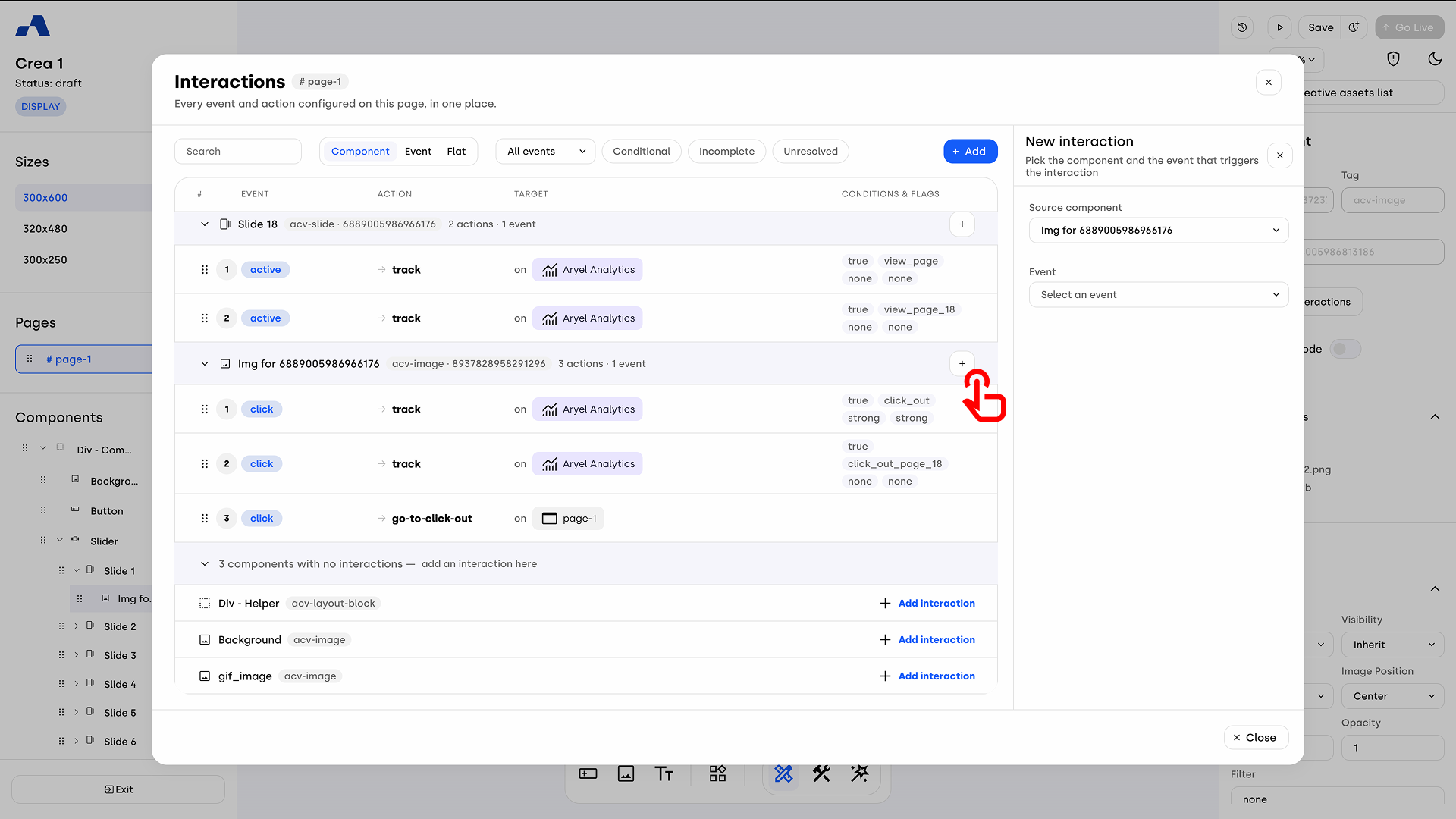
By clicking the + icon next to a specific component, an event, or the "All interactions" heading, depending on which view (Component, Event, or Flat) you are currently using.
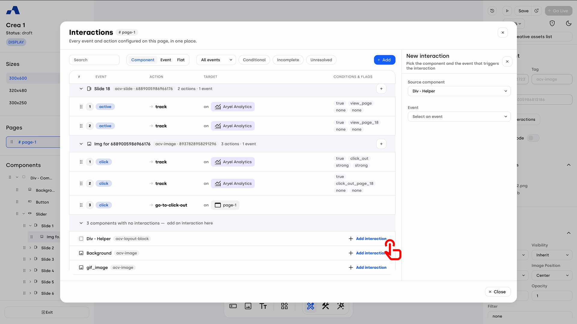
Note for the Component view: When you add an interaction from this view (or if you click "+ Add interaction" in the list of components without interactions at the bottom), the "Source component" field of the new event will be conveniently pre-filled with the respective component, although you always have the freedom to change it from the dropdown menu.
Page Overview
On the right side of the screen, when no interaction is selected for editing, the Page Overview is visible. This section provides a useful summary of the page's interaction status (total interactions, events in use, etc.). Its most important function is diagnostics: in the "Needs Attention" section, the system highlights any Incomplete or Unresolved interactions ("Broken references found"). For each error, a brief explanation is provided as to why the action is not working (e.g., "Its target no longer exists" or "It plays an animation that no longer exists"), along with a convenient clickable link that takes you directly to the specific interaction so you can fix it quickly.
Managing Click-Outs: Go to Link vs. Go to Click Out
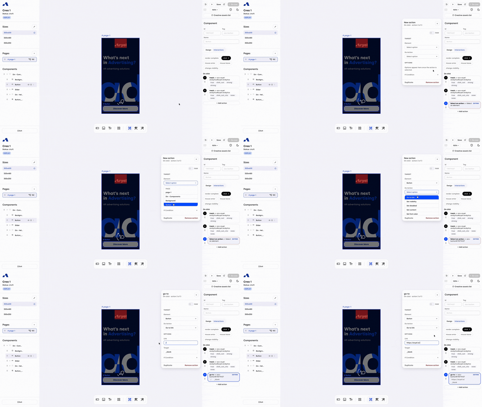
One of the interactions worth mentioning is the Go to Link interaction. To configure this:
Select the component that should redirect users and navigate to the Interactions tab.
Click the desired event trigger (e.g., "click") and then click + Add action.
In the Element field, choose either a Button or a Click Area (these must already be present on the page).
In the Do Action field, select "Go to Link".
A new input field will appear where you can insert the URL you'd like to redirect users to, together with the browser target option. It will be pre-filled with '_blank' option, as the common behaviour for clicks to landing pages is to open a new page, but if you prefer to set it up differently, you can change it to '_self' that will open the landing page in the same page hosting the banner.
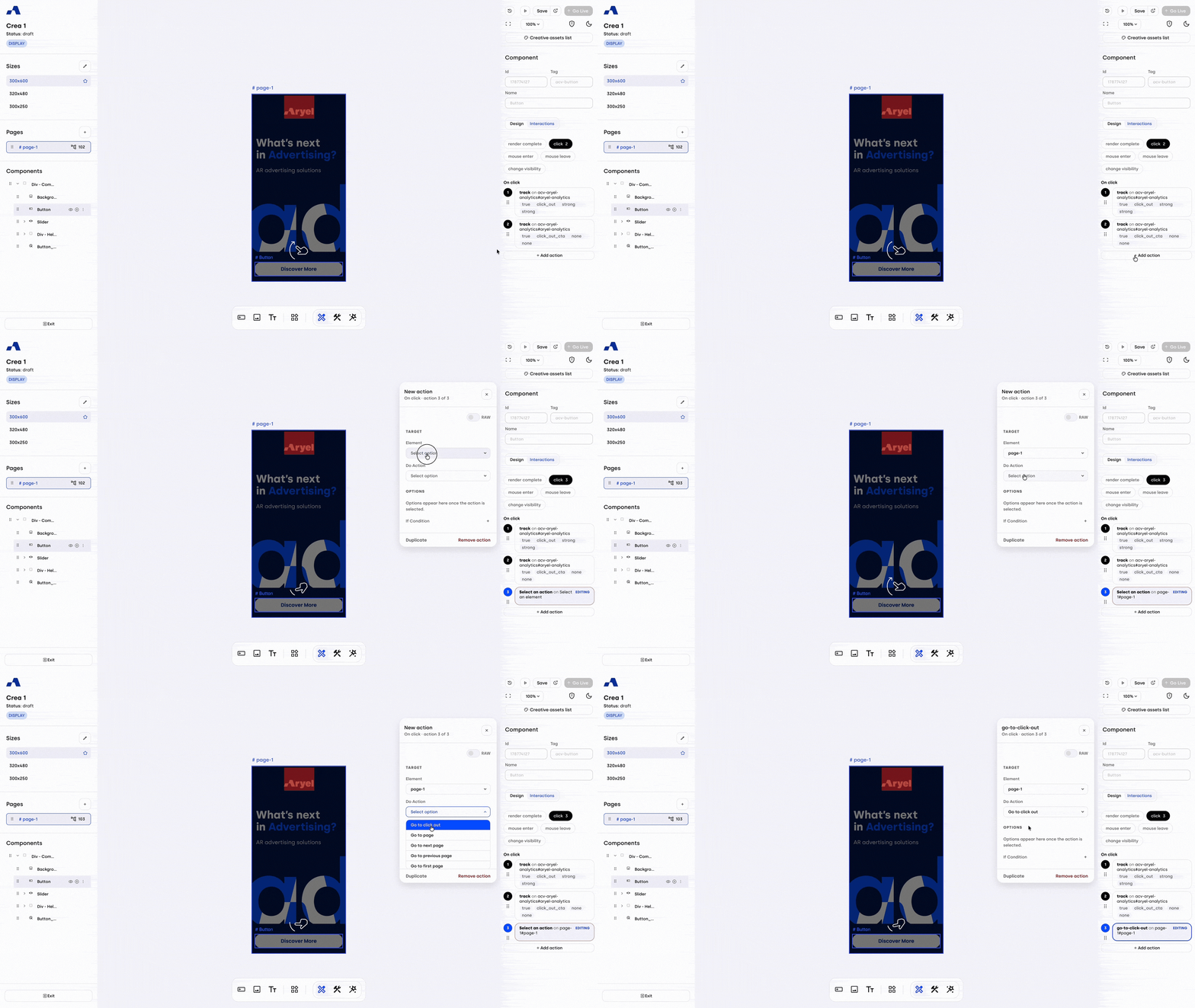
Another important interaction to be aware of is Go to Click Out. This interaction allows you to manage the click-out URL at a tag level, giving you the flexibility to assign a different destination URL to each of your tags. It also provides the required connection to the click macro, making it essential for proper tracking.
To configure this interaction:
Select the component you want to assign the interaction to.
In the Interaction tab, choose the user action (e.g. “on click”) that should trigger the event.
Click the + Add action button.
In the Element field, select the page you're working on.
In the Do Action dropdown, choose Go to Click Out.
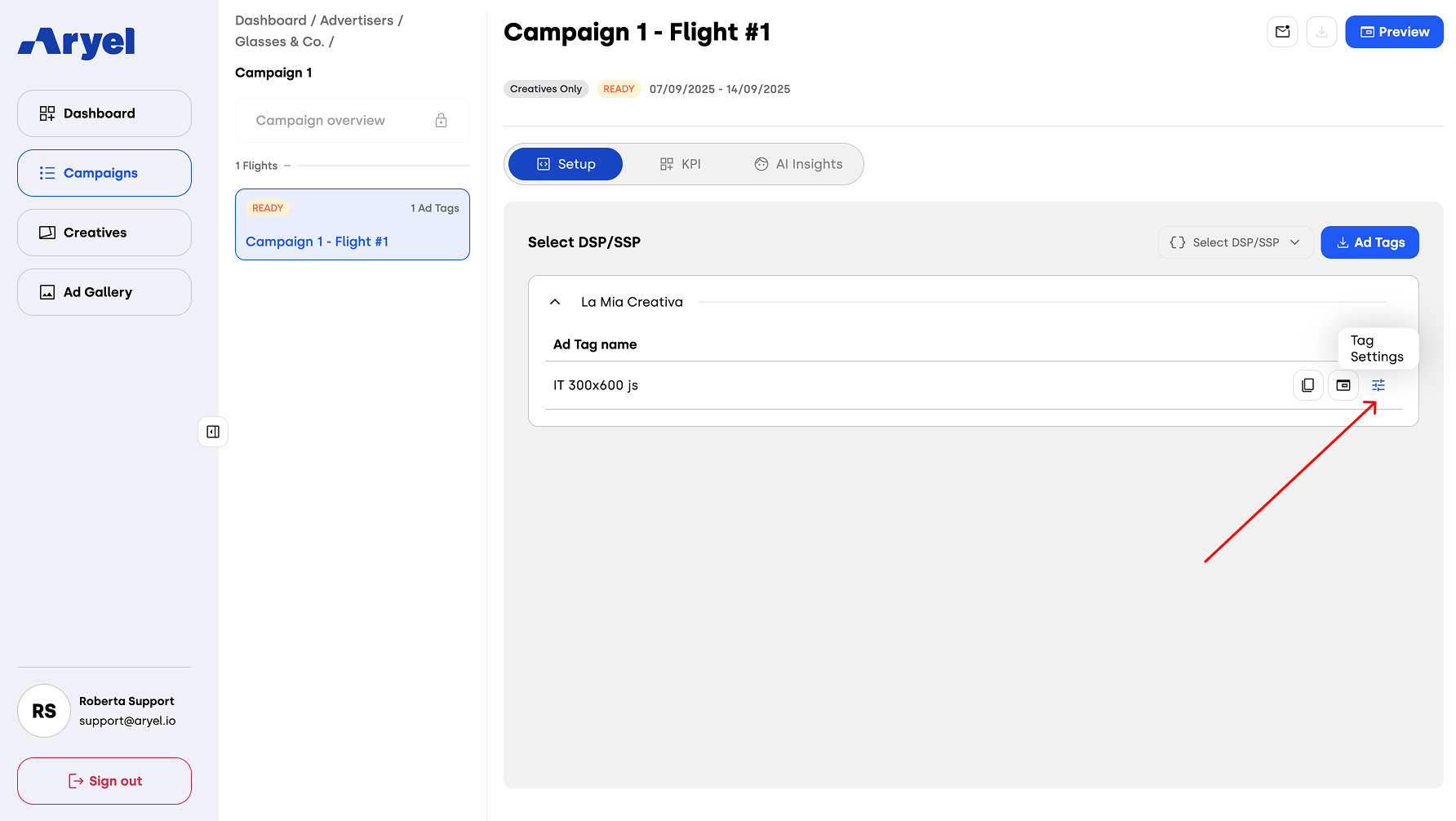
Once the interaction is configured, the final step is to assign the desired URL at the tag level.
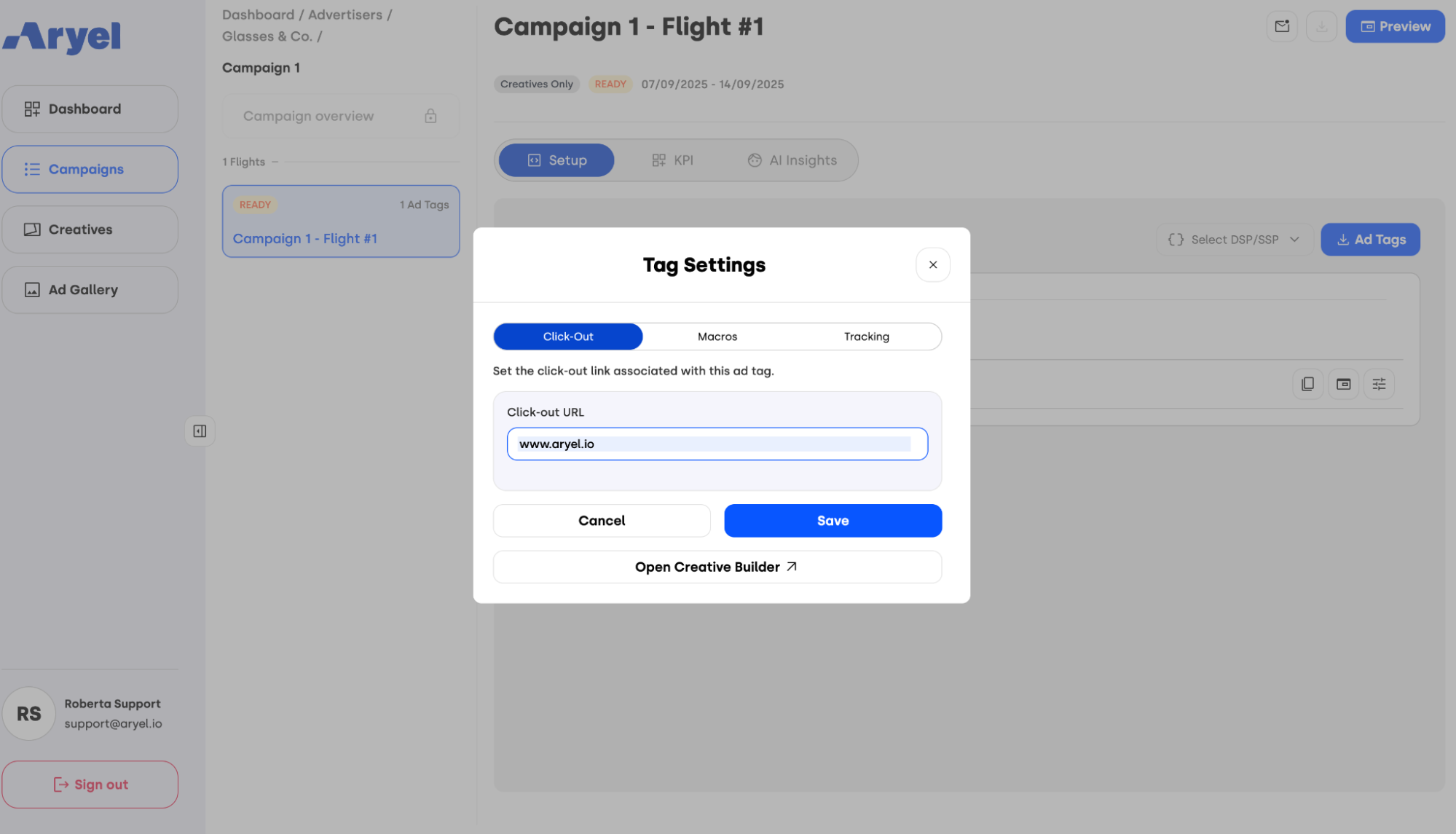
To do this, go to the Flight Detail Page linked to your creative. Under the Setup tab, click the Tag Settings button on the relevant tag row.
A modal will open with three sections: Click-Out, Macros and Tracking. The first one is the one where you’ll need to enter the destination URL that the tag will point to. Once you’ve inserted the click-out URL, hit Save to confirm your edits.
Additionally, it’s important to understand the differences between Go to Link and Go to Click Out, as they are the two available methods to manage click-out behavior in creatives built with Ads Manager Builder.
Go to Link allows you to insert multiple different URLs within the same creative. This is ideal if you want to redirect users to different pages based on the product or element they interact with. However, keep in mind that this method manages click-outs at the creative level, not the tag level.
Go to Click Out, on the other hand, is optimized for strategies that require a single click-out URL per tag and is especially useful if you want to manage different click-outs for each tag. In this case, the creative itself won’t perform any redirect — instead, the destination is configured in the Tag Settings, and when previewing the creative in the builder, clicking on it won’t lead anywhere.
Both methods offer specific benefits depending on how you plan to structure your click-out strategy. Choose the one that best aligns with your campaign objectives.
Interactions are what make your ad experience truly interactive. By managing them carefully, you can guide user behavior, create seamless transitions, and make your creative more engaging and effective.