Slider allow you to showcase a sequence of visuals or videos inside a single creative space, making them ideal for flyers, showcases, or carousels. Slider is foundational for building dynamic Aryel ads.
Adding a Slider
You can add a Slider either via the toolbar or from the left sidebar. Once inserted into the page, you'll find the new component listed under the Layers section.
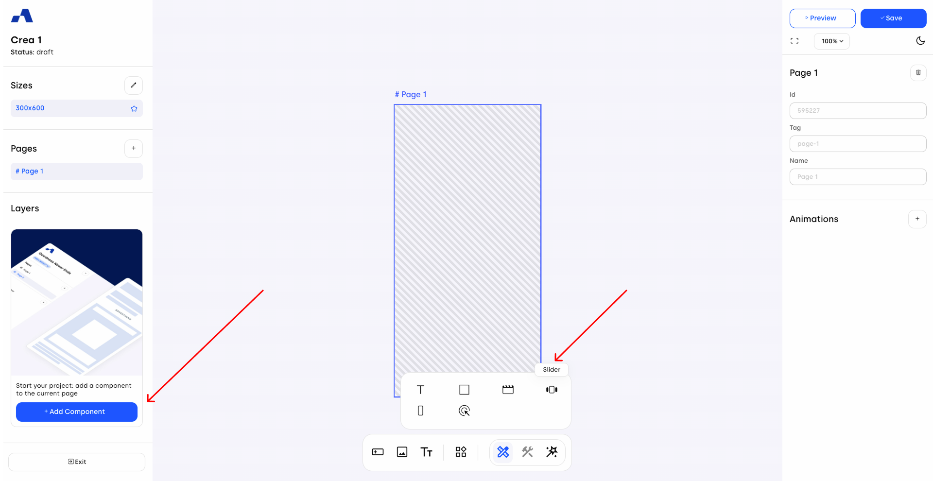
Click the slider row to access its specific settings.
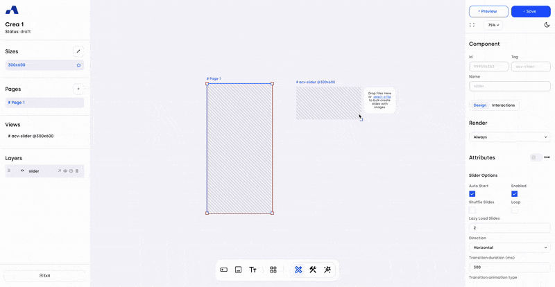
One of the unique features of the slider component is the arrow icon next to its name in the Layers panel. Clicking it will open a dedicated view that allows you to bulk-upload images or videos.
These assets are automatically added as child components within newly created Slide components, which are in turn nested under the main Slider.
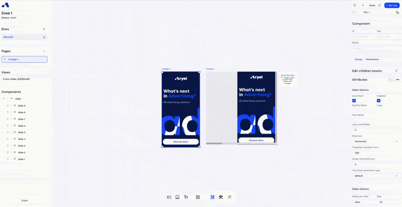
If you need to upload additional slides after the initial bulk-upload, click on Select File and choose the new assets. You can then decide how to position them:
Insert at the end: Add the new slides after the existing ones.
Replace: Substitute the current slides (if you upload fewer assets than the existing slides, you will need to manually delete any excess ones).
Insert at the beginning: Add the new slides before the existing ones.
Additionally, you can choose which size to upload them to. If you apply the changes to the default size, all other sizes will automatically inherit the newly loaded assets.
Right Sidebar Configuration
When the slider is selected, the right sidebar updates with dedicated settings split into two main tabs: Design and Interactions.
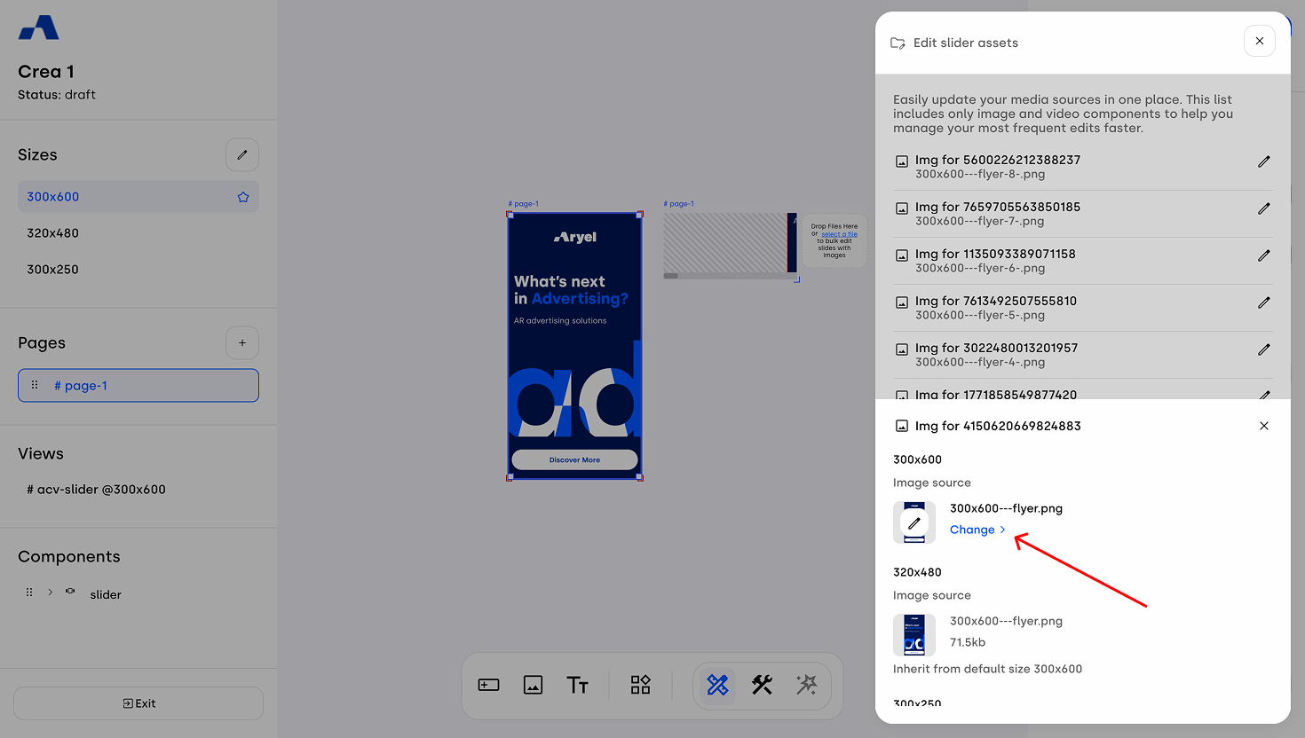
Edit children assets: This option allows you to quickly change all the assets included in the several slides.
By clicking the pencil icon, a side panel will open displaying all the child assets contained within the slider.
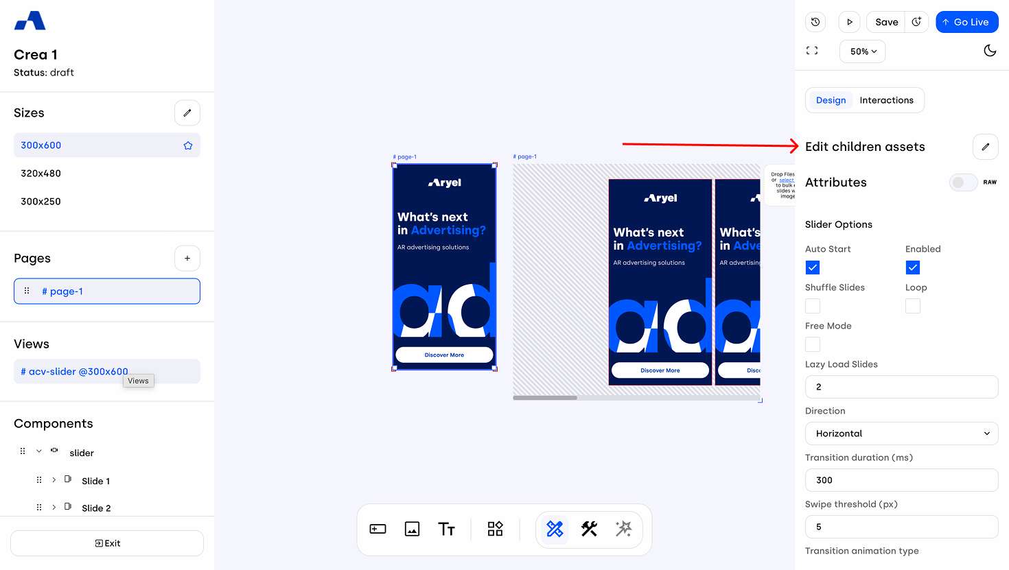
Click the pencil icon next to the specific asset you want to update to replace the content for each size with another asset from the library.
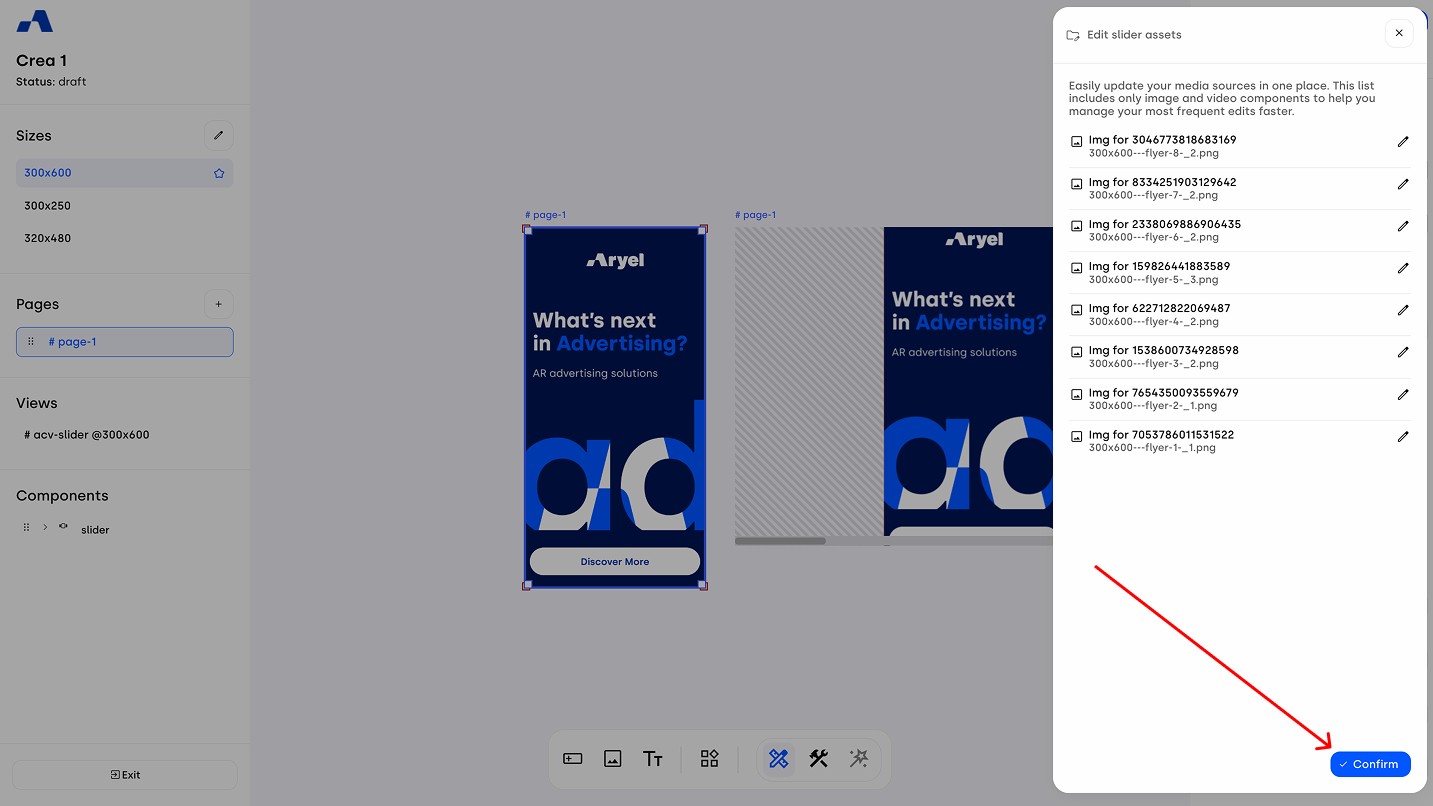
Once you have made your desired changes, click Confirm to apply them all.
Design Tab
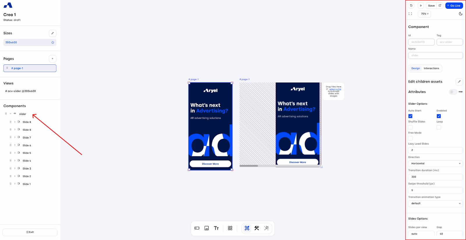
1. Slider Options
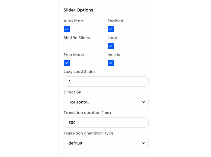
Playback Settings: Options include Auto Start (slider initialization on banner loaded), Enabled (slider interaction activation), Shuffle Slides, and Loop.
Free Mode: When this option is enabled, the slider no longer snaps automatically to center individual slides. Instead, it remains positioned exactly where the drag action is released, providing a smoother and more natural manual scrolling behavior.
Inertia: Available only once Free Mode is enabled, this setting lets you decide whether to apply inertia to the slider. When activated, the slider continues moving after the drag is released, simulating natural momentum. The extent of this movement varies according to the intensity of the user’s swipe.
Free Mode and Inertia can be activated independently of the transition effect assigned to the slider.
Lazy Load Slides: The number of slides that will be immediately loaded along with the one active.
Direction: Choose between vertical (for flyers or showcases) or horizontal (for carousels).
Transition Duration: Set the slide transition speed in milliseconds.
Transition Animation Type: Define the style of slide easing.
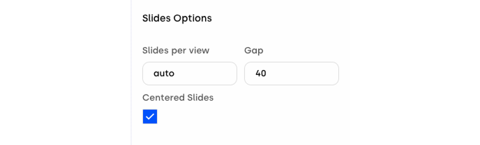
2. Slides Options
Slides Per View: Determine how many slides are visible at once.
Gap: Set spacing between slides.
Centered Slides: Align the active slide to the center.
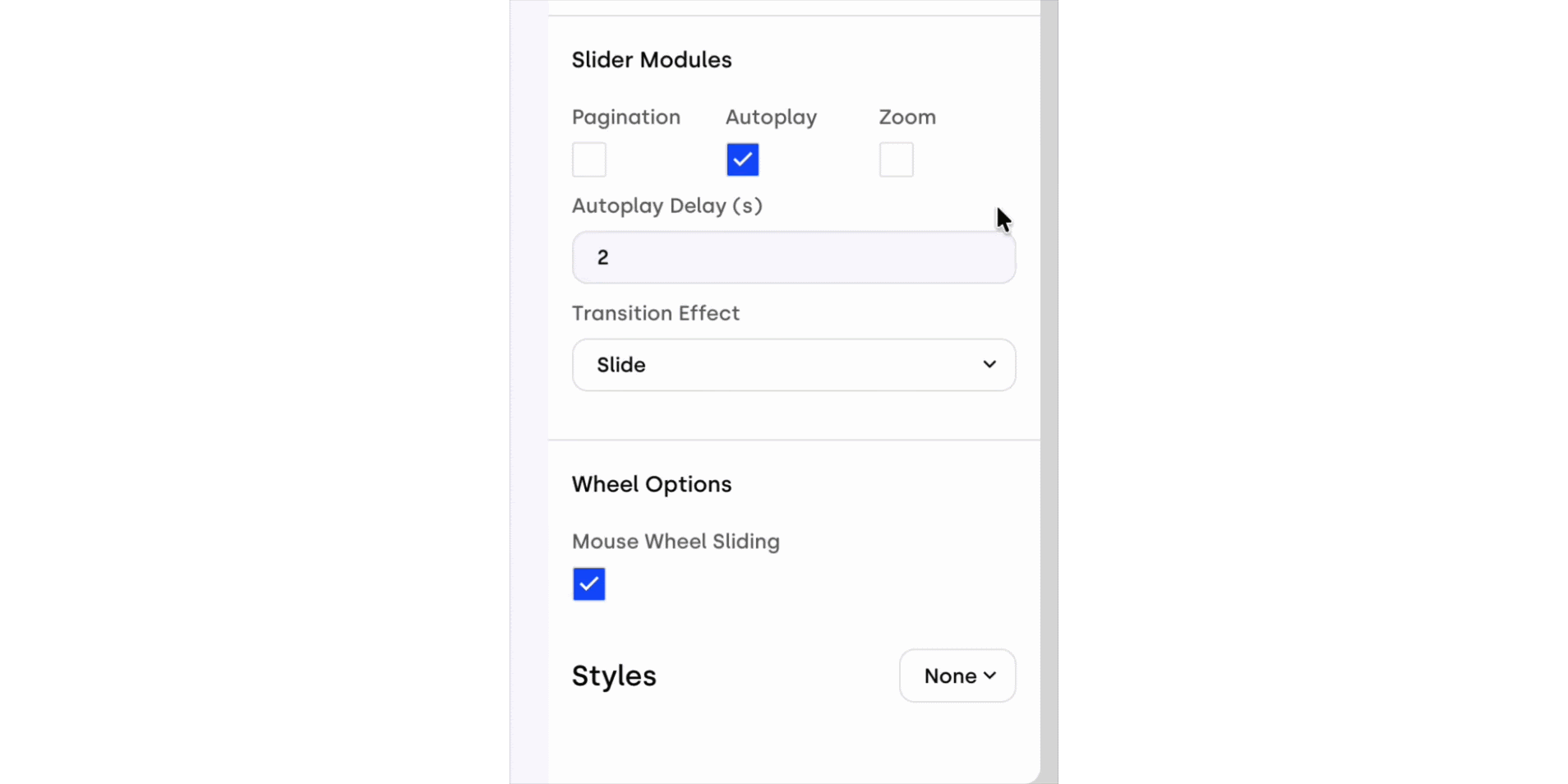
3. Slider Modules
Pagination: Enable navigation dots. When active, a list of customizable properties is available at the bottom of the right sidebar.
Autoplay Settings: Set whether autoplay is active and the delay time before starting.(in seconds)
Transition Effect: Choose from multiple visual effects for slide transition.
Zoom: Activating this module enables the Zoom Options, where you can define Zoom Step and Max Zoom. When active, the slider becomes zoomable on mobile devices via the pinch-to-zoom gesture.
4. Scroll Options
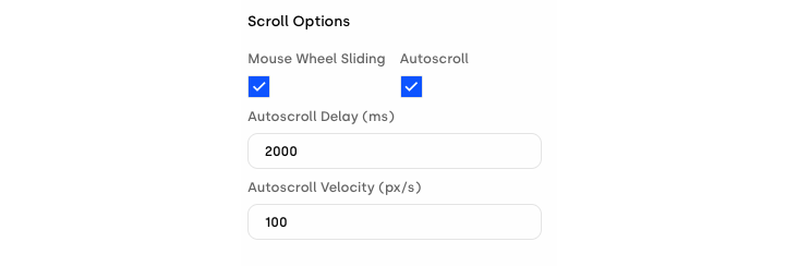
Mouse Wheel Sliding: By enabling this option, it is possible to navigate the slider through the use of the mouse scroll wheel.
Autoscroll: When enabled, it allows the slider to scroll automatically. The scroll pauses during user interaction, specifically when dragging or scrolling, and during zoom actions (if enabled) until the scale returns to the original size. This feature includes two customizable parameters:
Autoscroll Delay: indicates the amount of time (in milliseconds) of inactivity after the last user interaction before the autoscroll restarts.
Autoscroll Velocity: defines the constant speed (in pixels per second) at which the slider moves during the automatic scroll.
5. Styles
This section includes all style controls (typography, padding, borders, etc.), consistent across all components. This section is based on standard CSS structures — for more information, click here.
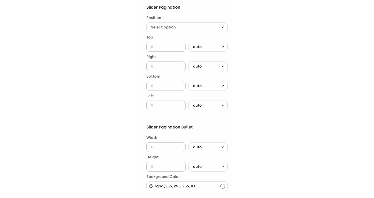
5. Slider Pagination (if activated)
If pagination is enabled, scroll down the right sidebar to find options for modifying the pagination style, including color, size, and position.
Interactions Tab
The interactions tab allows you to add behaviors based on user actions. You can define what happens when users engage with the slider in various ways. For each interaction, you can assign elements and define their behavior when the event happens by selecting them from the 'Do Action' list.
Available slider interactions include the following list:
On initialization | On slide transition start | On end wheel scroll |
On click slider | On slide transition end | On start autoscroll |
On click active slide | On navigate to last slide | On pause autoscroll |
On click not active slide | On swipe to the beginning | On slider change direction |
On change slide | On swipe to the end | On mouse enter |
On start drag | On slider pagination click | On mouse leave |
On manual slide change | On change zoom scale | On change visibility |
On autoplay slide change | On start wheel scroll |
These can be used to trigger animations, show/hide components, track events, and more.
The slider is a cornerstone component of Aryel creatives. Its powerful layout flexibility, combined with visual and interactive settings, makes it an essential tool for building engaging ad experiences. Familiarizing yourself with its configuration options will allow you to fully unlock its potential within your campaigns.