To start building your ad within the Creative Builder, you’ll need to add assets to the default page that’s automatically generated when you create a new ad.
Here’s a quick reminder of the components available to you — from buttons and images to rich text, text, block layouts, sliders, videos, and click areas. The addition of new components can be performed exclusively in Designer Mode.
There are two main methods to add components to your creative: the left sidebar and the central toolbar.
Method 1: Use the Left Sidebar
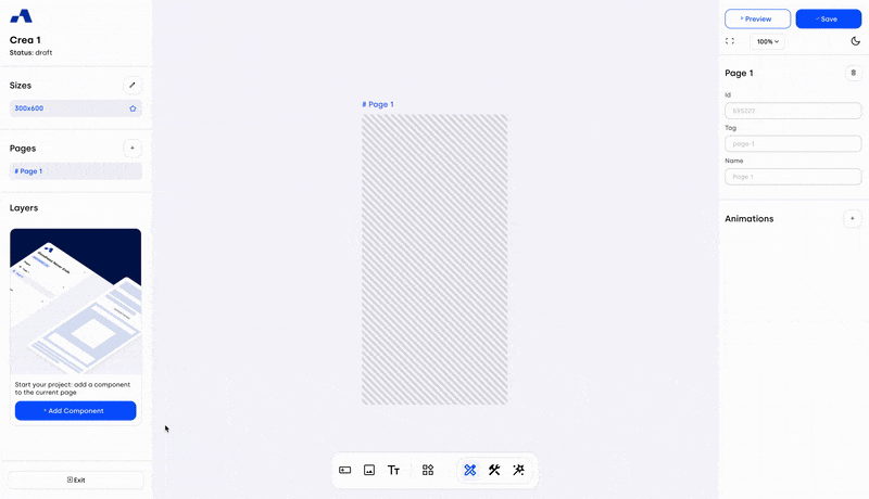
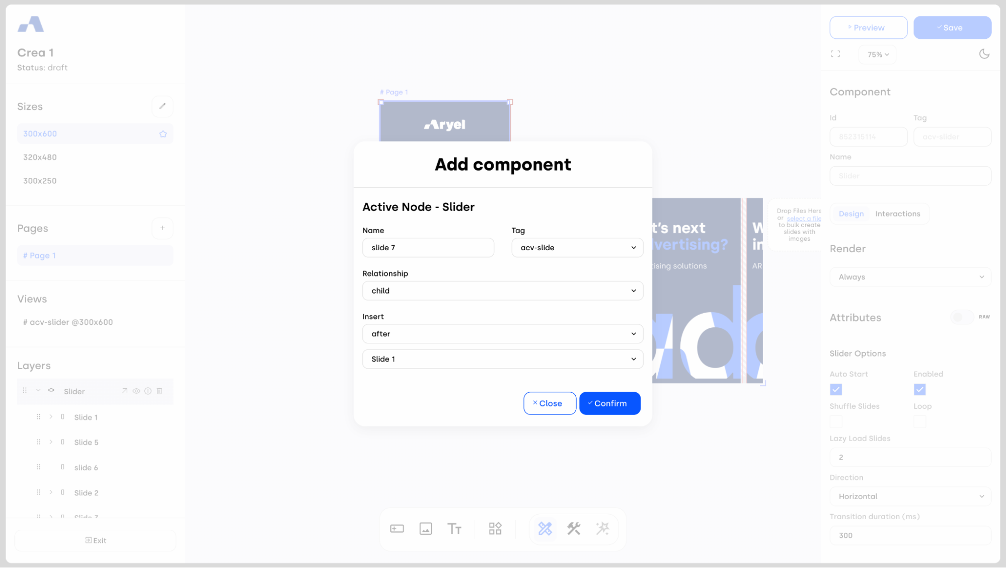
You can add components through the left sidebar. Click on the page (either from the sidebar or directly in the workspace), and a button labeled "Add Component" will appear on the left. Clicking this opens a modal with two fields:
A field to name the component you're adding.
A dropdown menu to select the component type.
Once you confirm, the component will automatically be added to the selected page.
Method 2: Selection from the Toolbar
Use the bottom toolbar located in the center of the workspace. Select the component you want, then put your cursor into the page area. When a green outline appears, simply click to place the component inside the page. Once placed, you can begin customizing it right away.
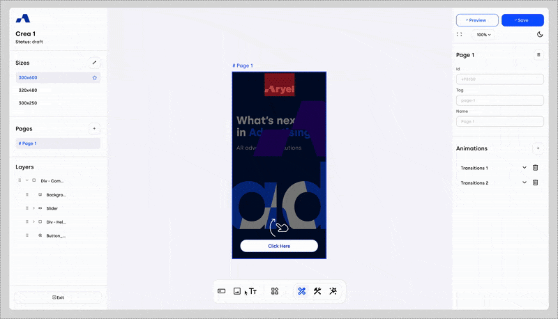
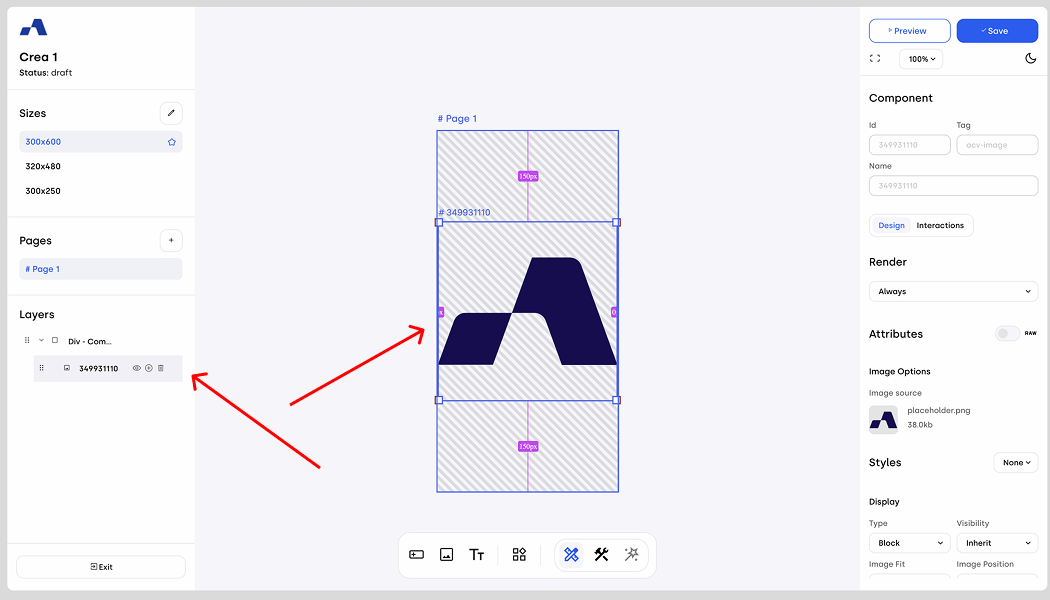
One key feature is snap alignment: as you move elements around, alignment guides will appear, allowing you to easily snap components into place relative to other items or to the edges of the page.
Type of relationship
There are two types of relationships that can be established between components:
Child Relationship: a child component becomes part of a parent component. When a component is added with a child relationship, it is nested within the selected parent element. This means that if the parent component is deleted, all its child components will also be removed automatically.
An example of this is the Slide component, which can only be added as a child of a Slider component. The Slide cannot exist independently; it must be associated with a Slider.Sibling Relationship: a sibling component is an independent element that is not nested inside another component. It exists at the same level as other components and can be managed separately. If a sibling component is deleted, it does not affect the other elements in the layout.
You can create a child relationship both through the toolbar and the left sidebar. From the toolbar, when including a new asset in the page, by hovering over a component already included, its borders will turn green if the association parent/child is allowed or red if not.
Through the left sidebar instead, when clicking the plus icon to add a new asset and the "Add Component" modal opens, you will have two fields:
Type of Relationship: Choose between sibling and child.
Placement Order: Select whether the new component should appear before or after the selected component.
If you choose a child relationship, an extra dropdown will appear that allows you to define whether the new child should be inserted before or after an existing child component.
Layers Panel
Every time you add a new component, it will appear in the "Layers" section in the left sidebar. This panel helps you manage all components in your creative.
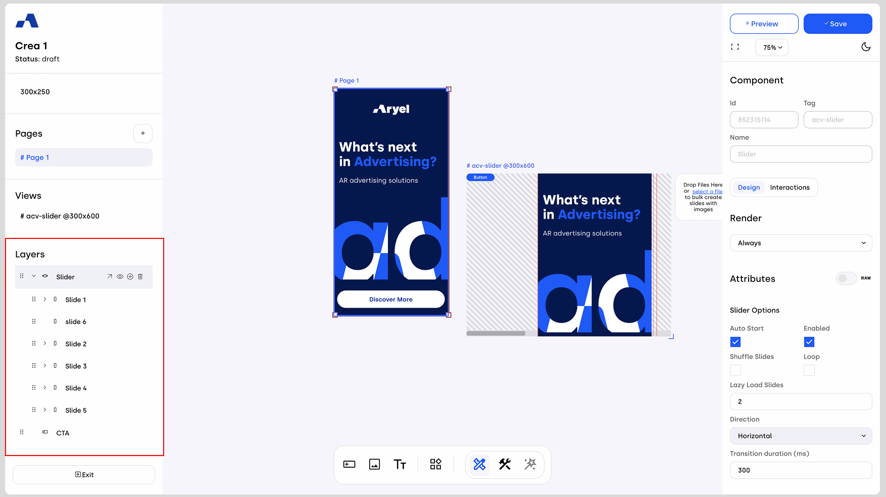
You can also reorder components directly within this section, which is especially useful if you need to change the relationship type between components.
Each component in the Layers panel has three icons:
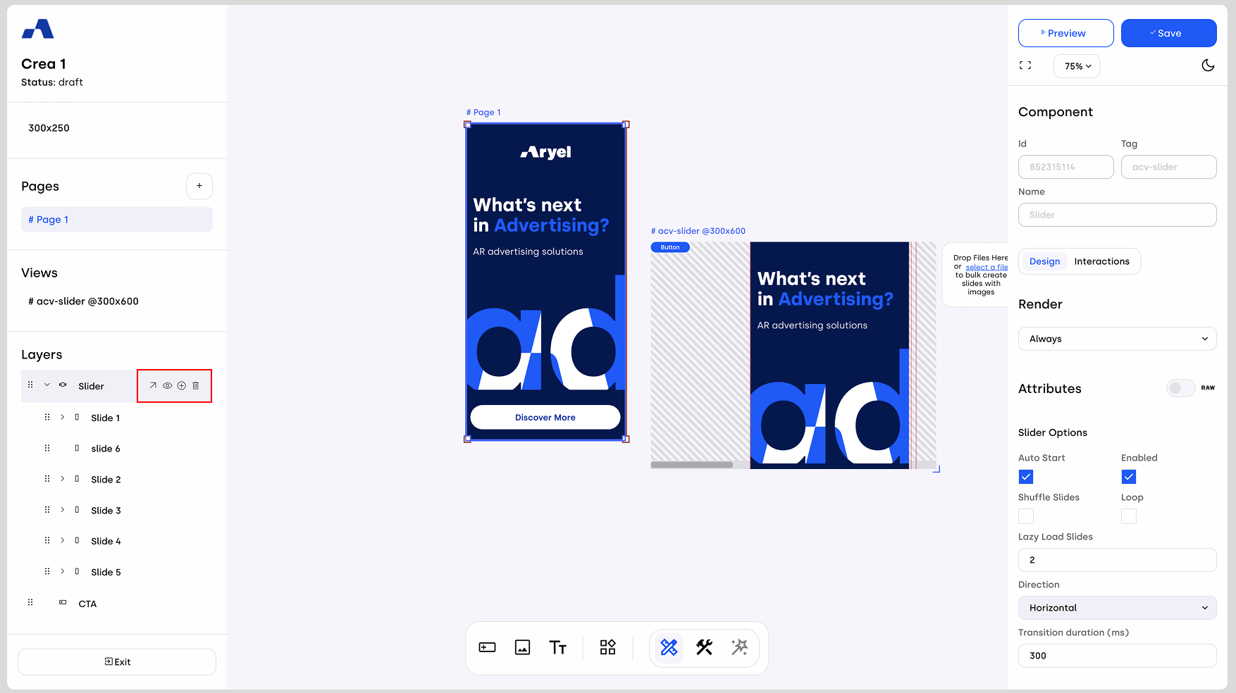
Eye icon: Toggle the component’s visibility on the canvas.
Plus icon: Add a new component.
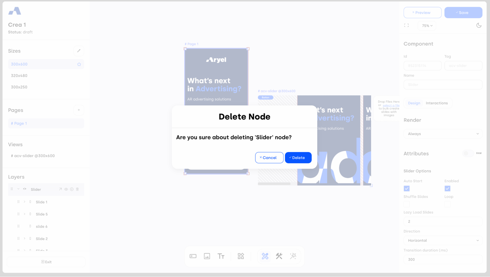
Trash bin icon: Deletes the component. If it contains child components, they will be deleted as well.
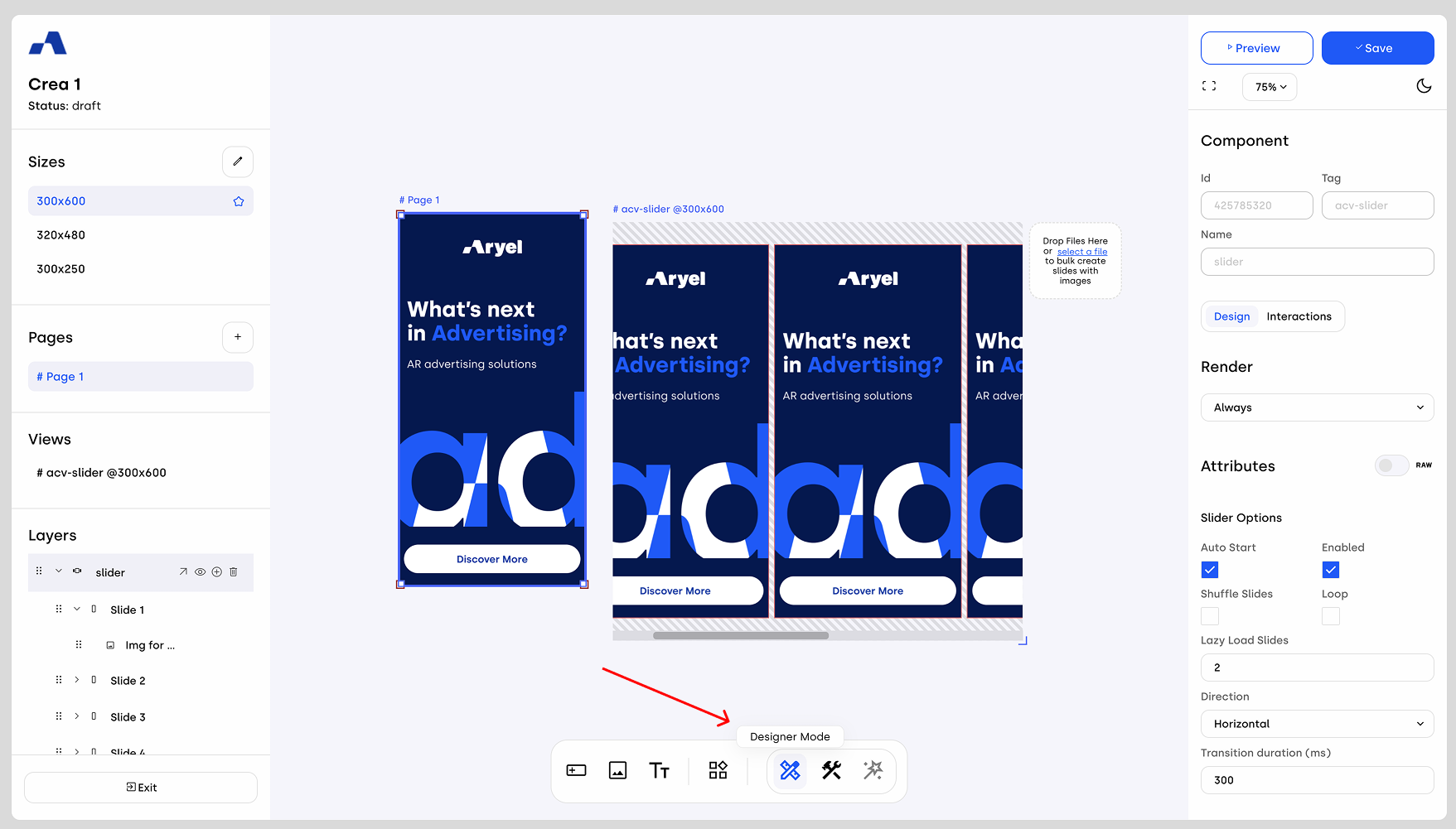
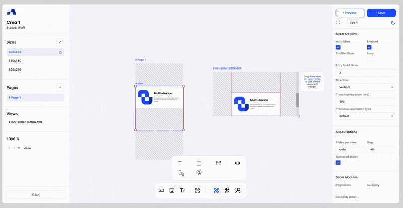
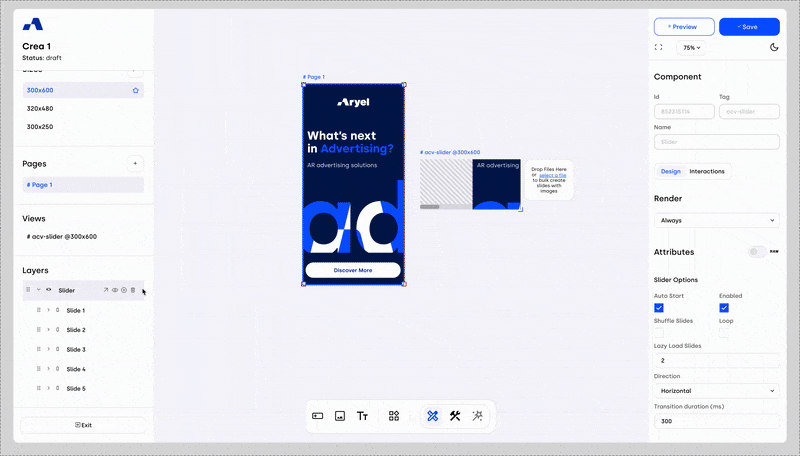
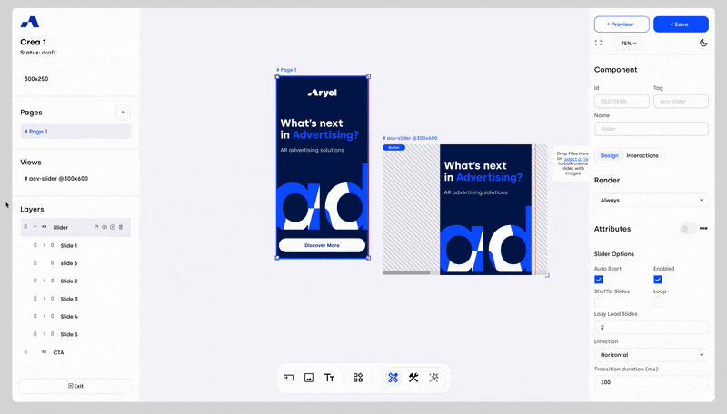
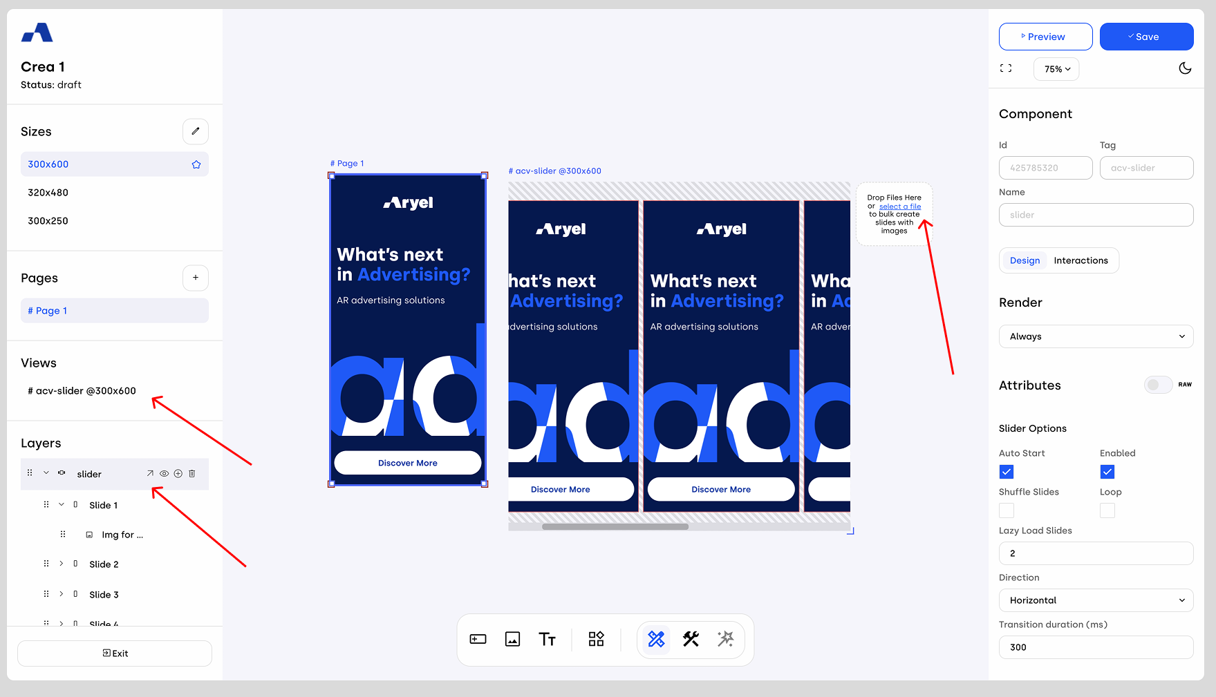
Arrow icon (only for Sliders): Clicking it opens a new slider view in the canvas where you can easily manage your slider. The main feature is the bulk-upload of the images. Each uploaded image is automatically added within a child Slide, making slider management much more streamlined.
This structure is designed to keep your workspace organized and give you full control over the composition and logic of your creatives. Take your time exploring each option and use the tools flexibly to suit the needs of your campaign.